Objective
This project focused on designing a visually engaging typographic poster that develops a cohesive visual system to effectively communicate a clear message and persuade viewers to attend an event. The poster should highlight the significance of a person's contributions through thoughtful typography, composition, and visual hierarchy while demonstrating research, analysis, and the ability to communicate ideas creatively through effective visual communication.
Research
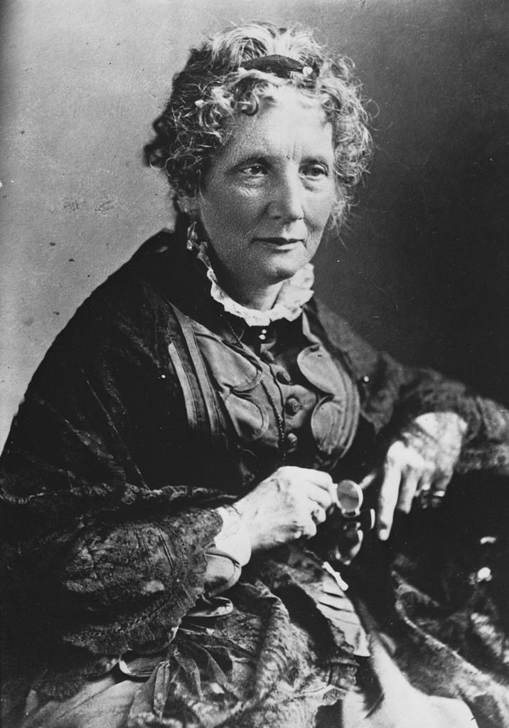
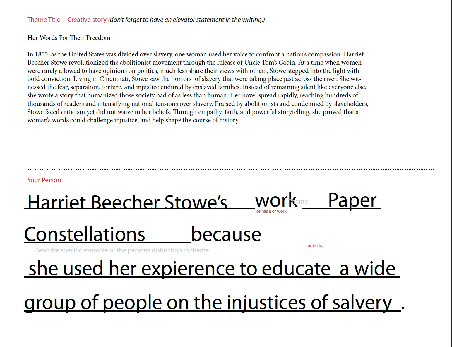
Recieved the category “Paper Constellations: Stories that Keep Finding New Light” and selected Harriet Beecher Stowe for the category. Began researching Stowe’s life, beliefs, and reading some of her work.
Physical Concept Making
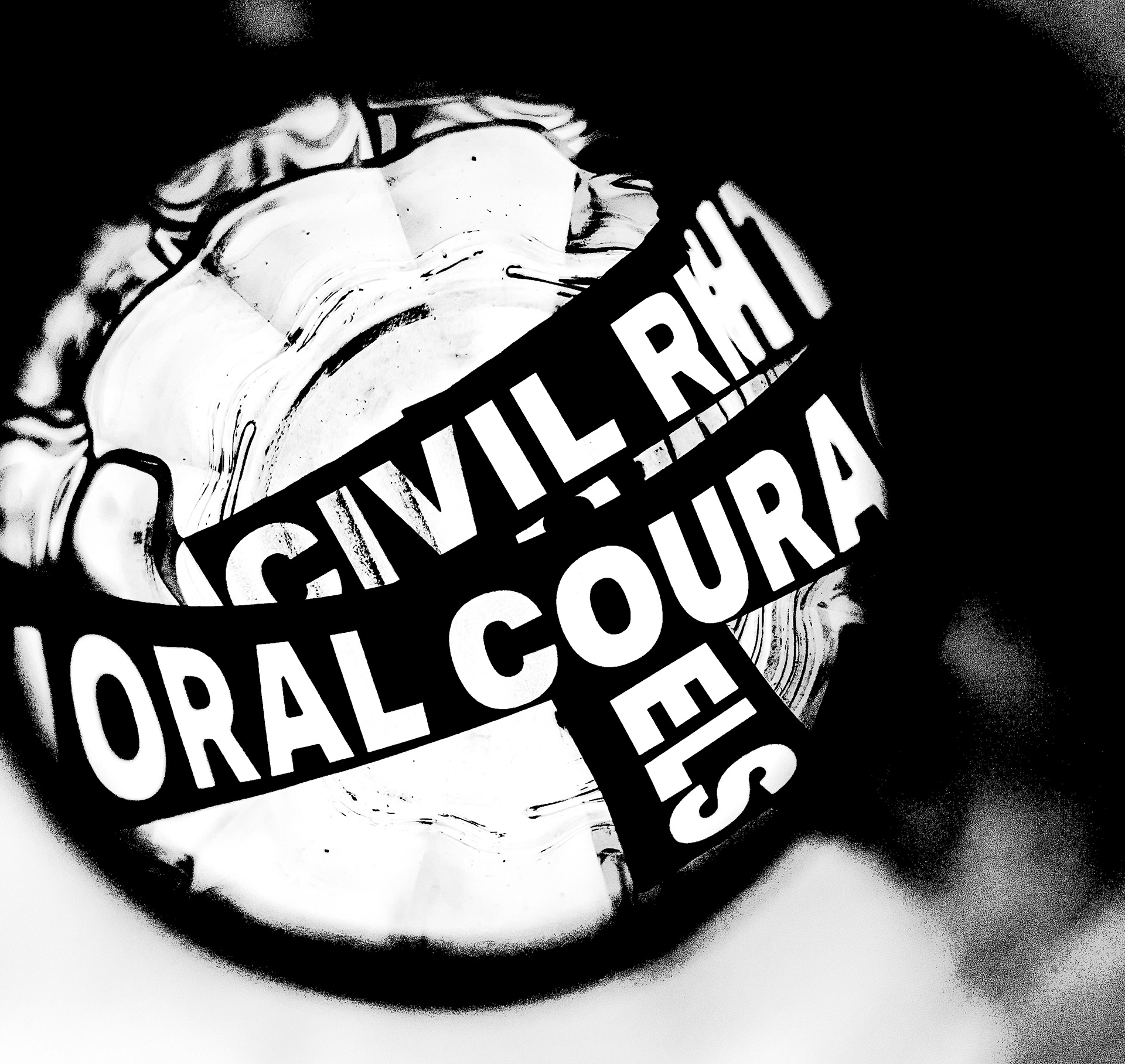
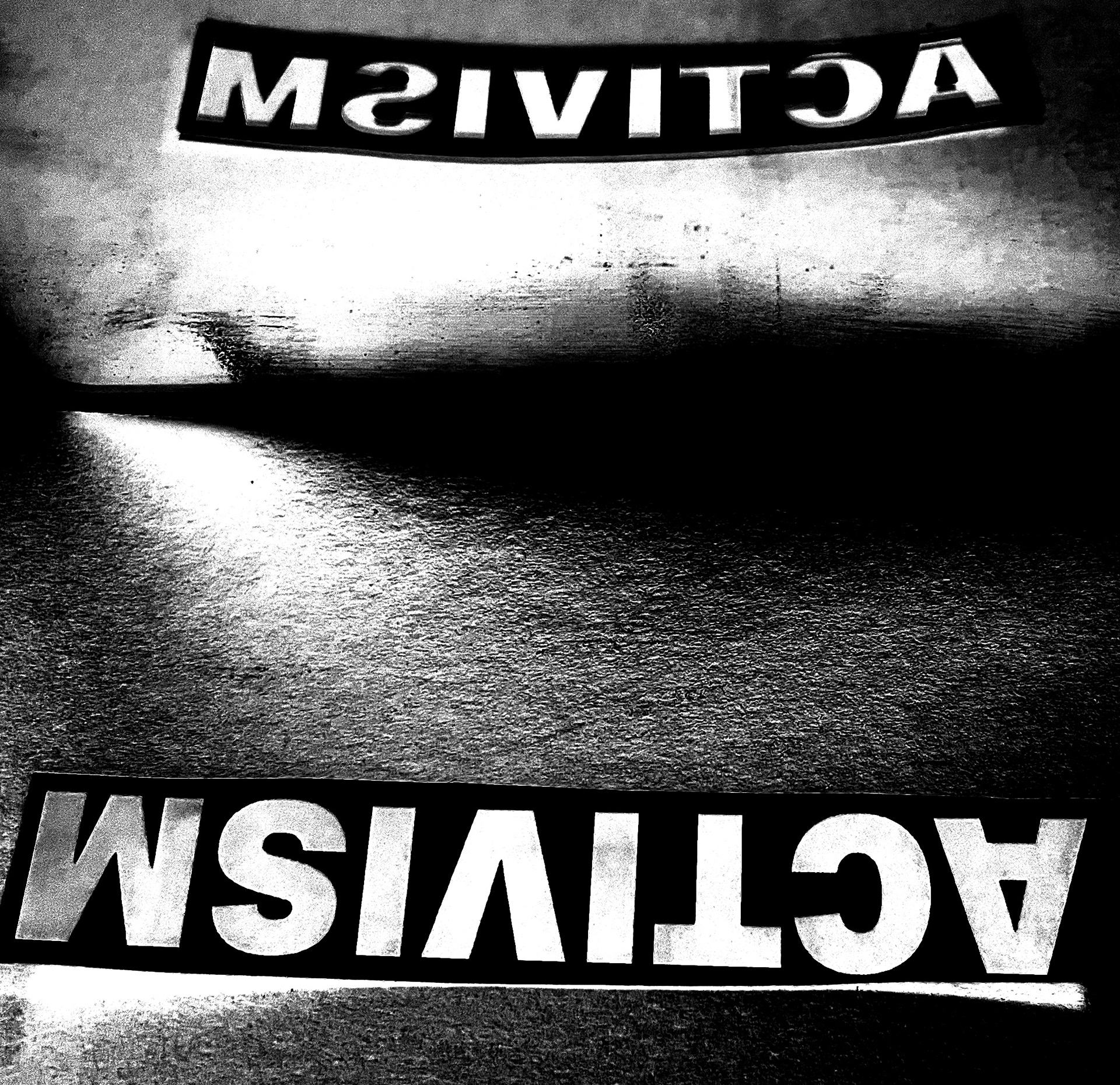
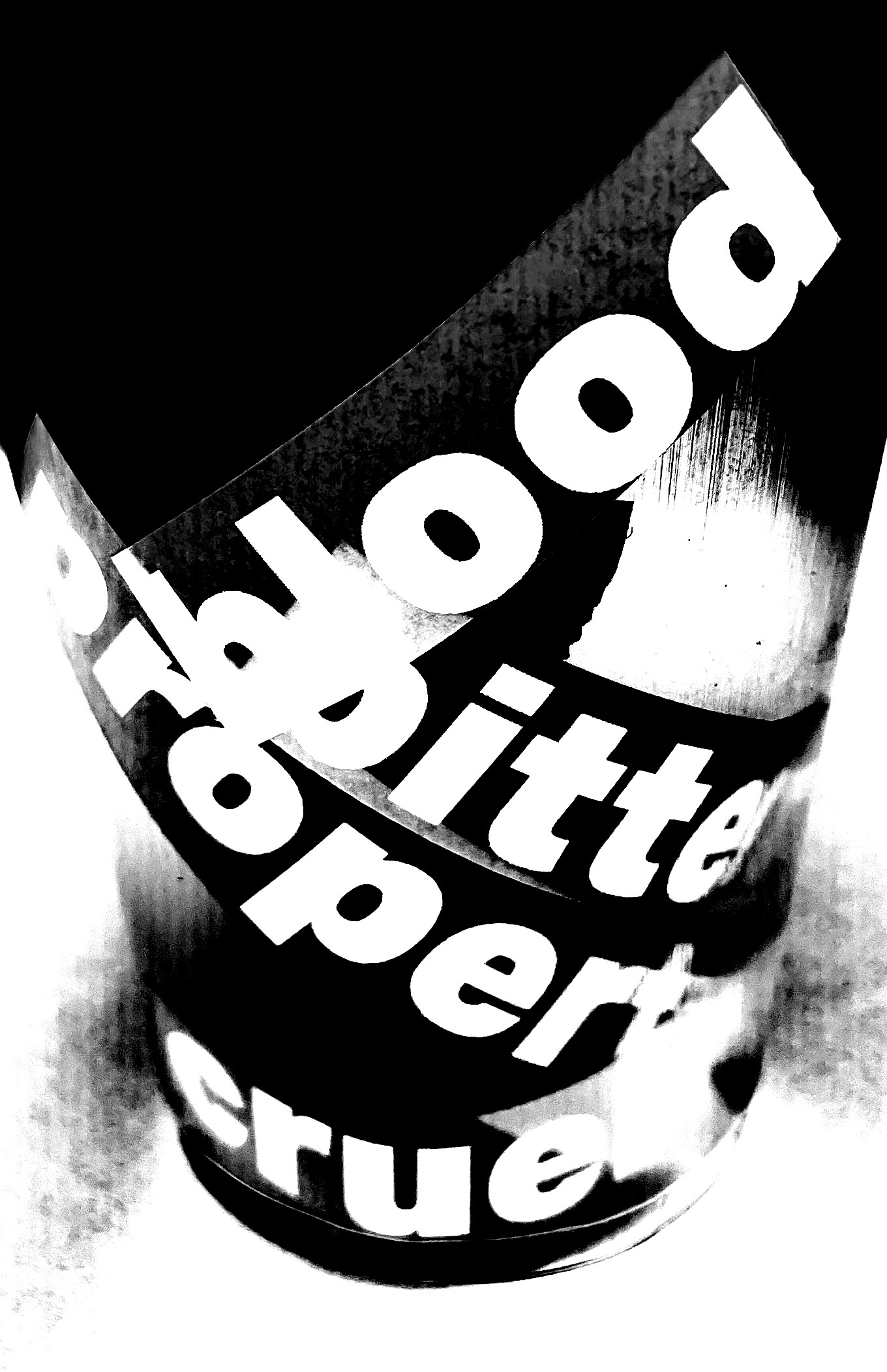
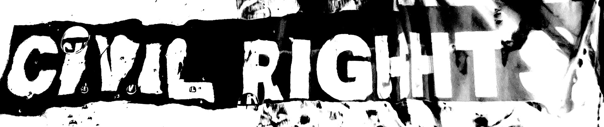
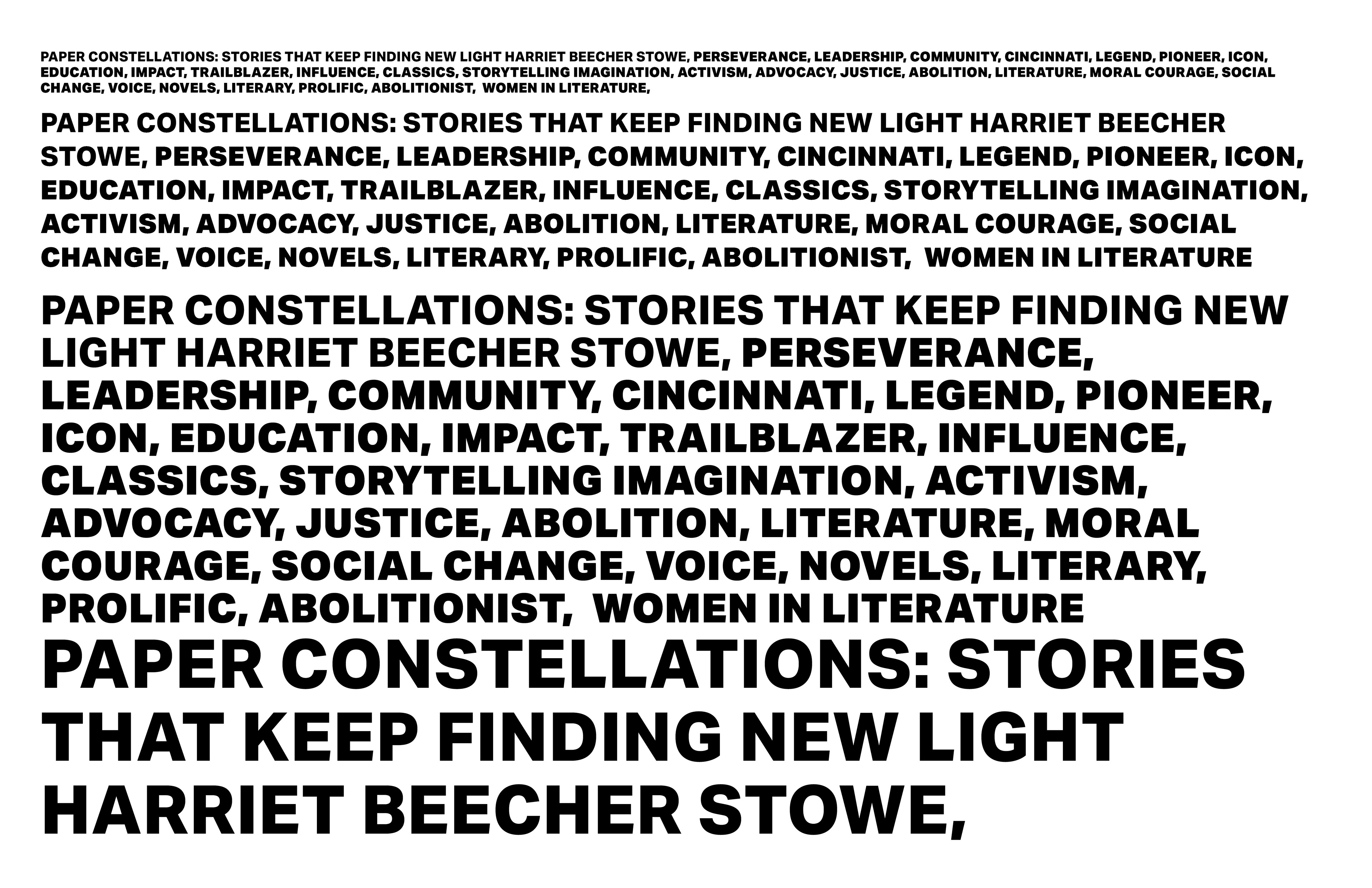
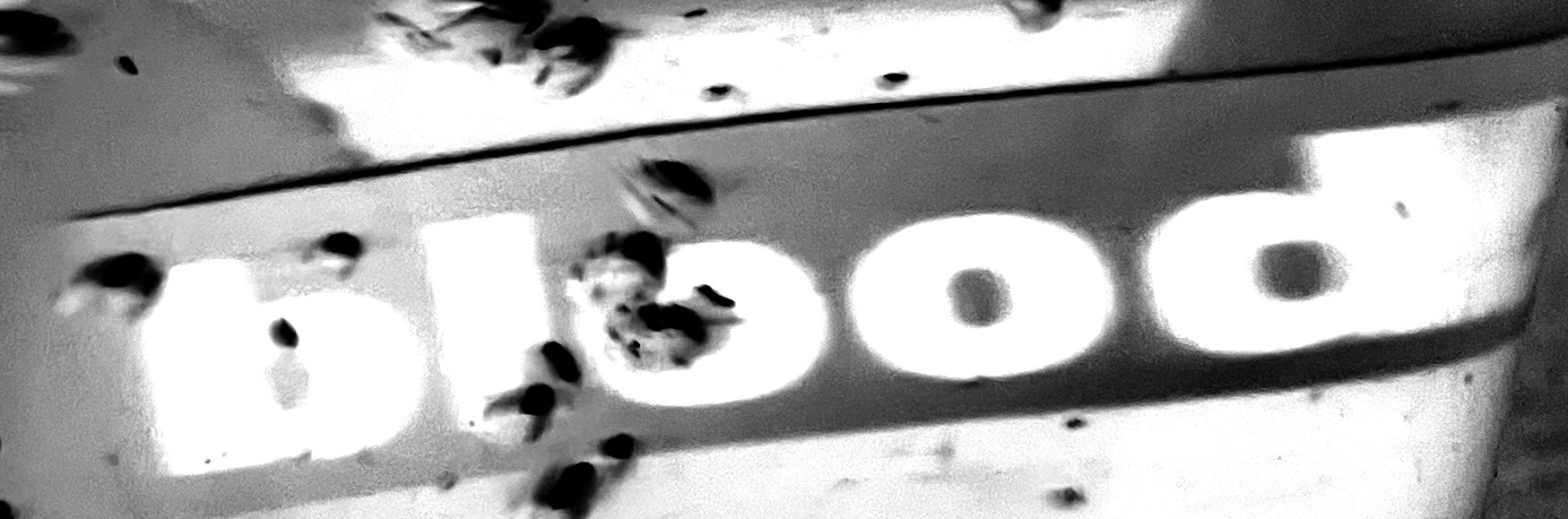
Explored a wide range of concepts through word association. Explored typography, materials, objects, and compositional layouts to develop a final direction.

Group sketches influenced the development of digital designs. More ideas were explored on paper to find a stronger concept.
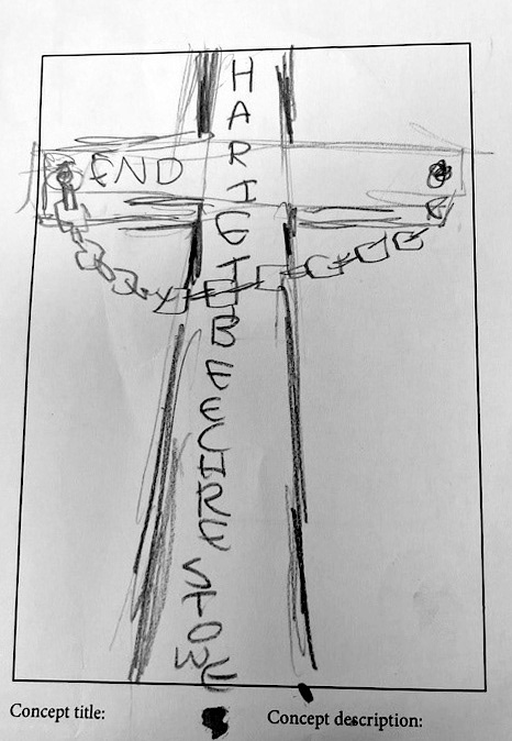
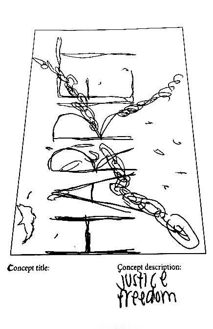
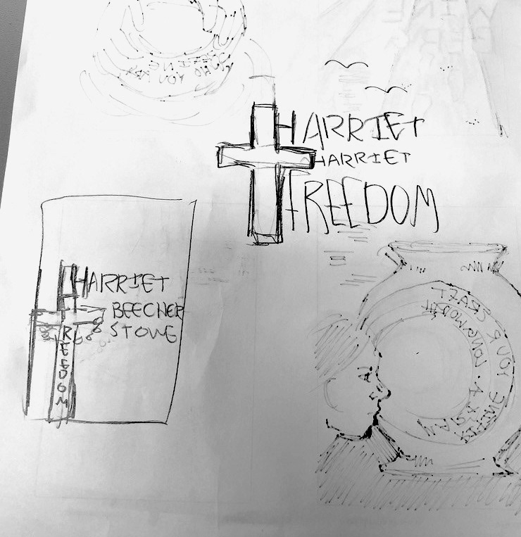
Digital Ideations

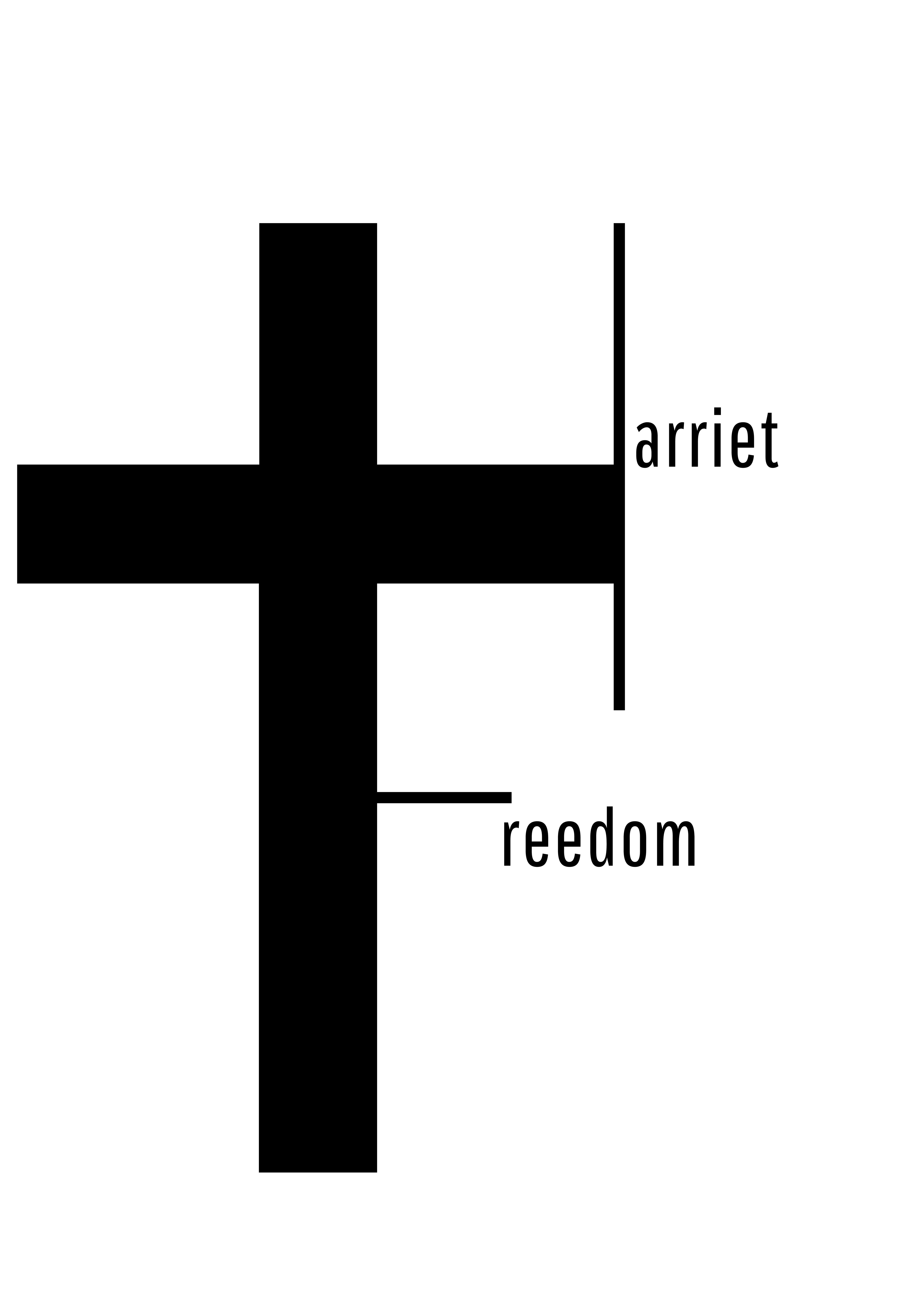
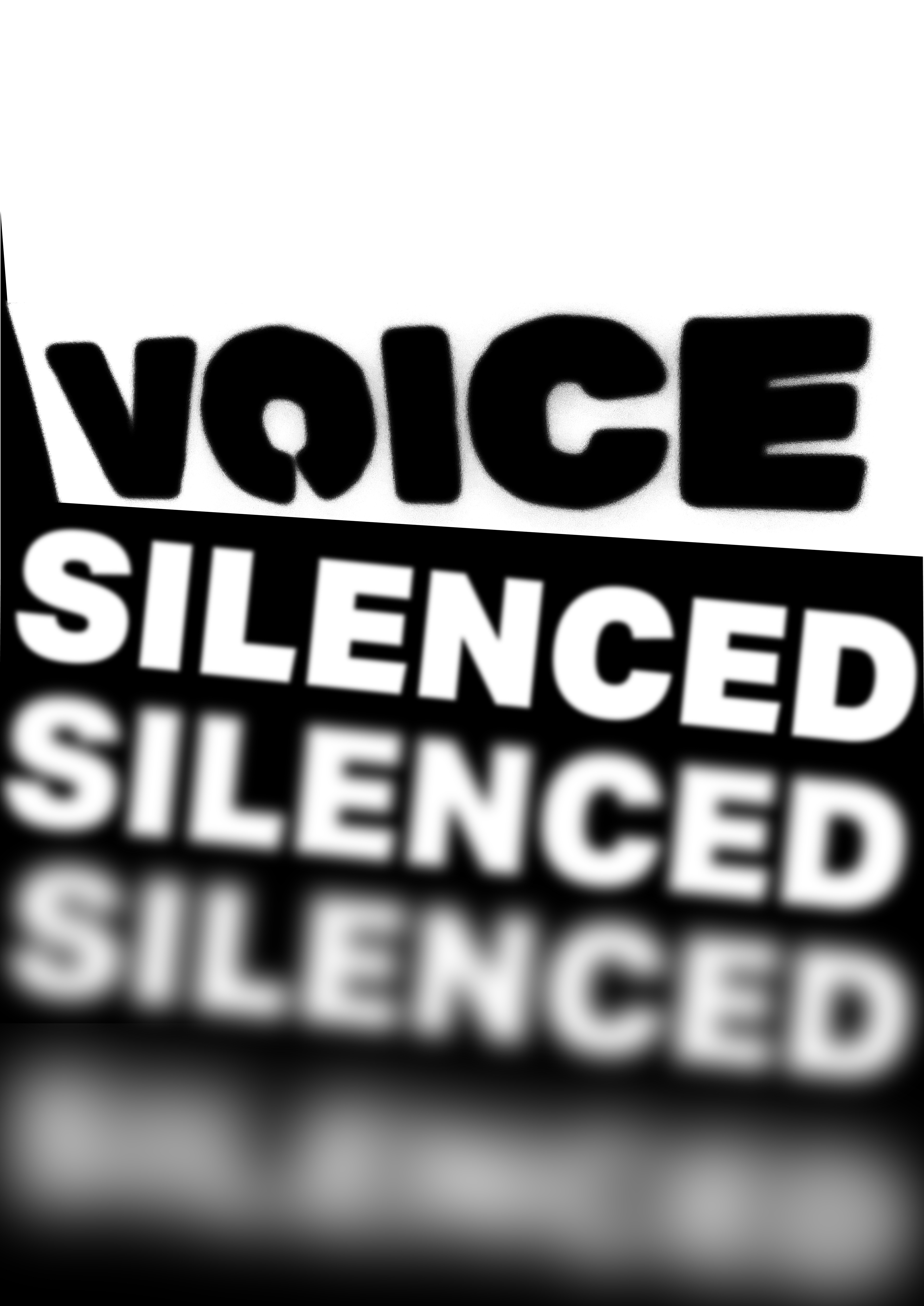
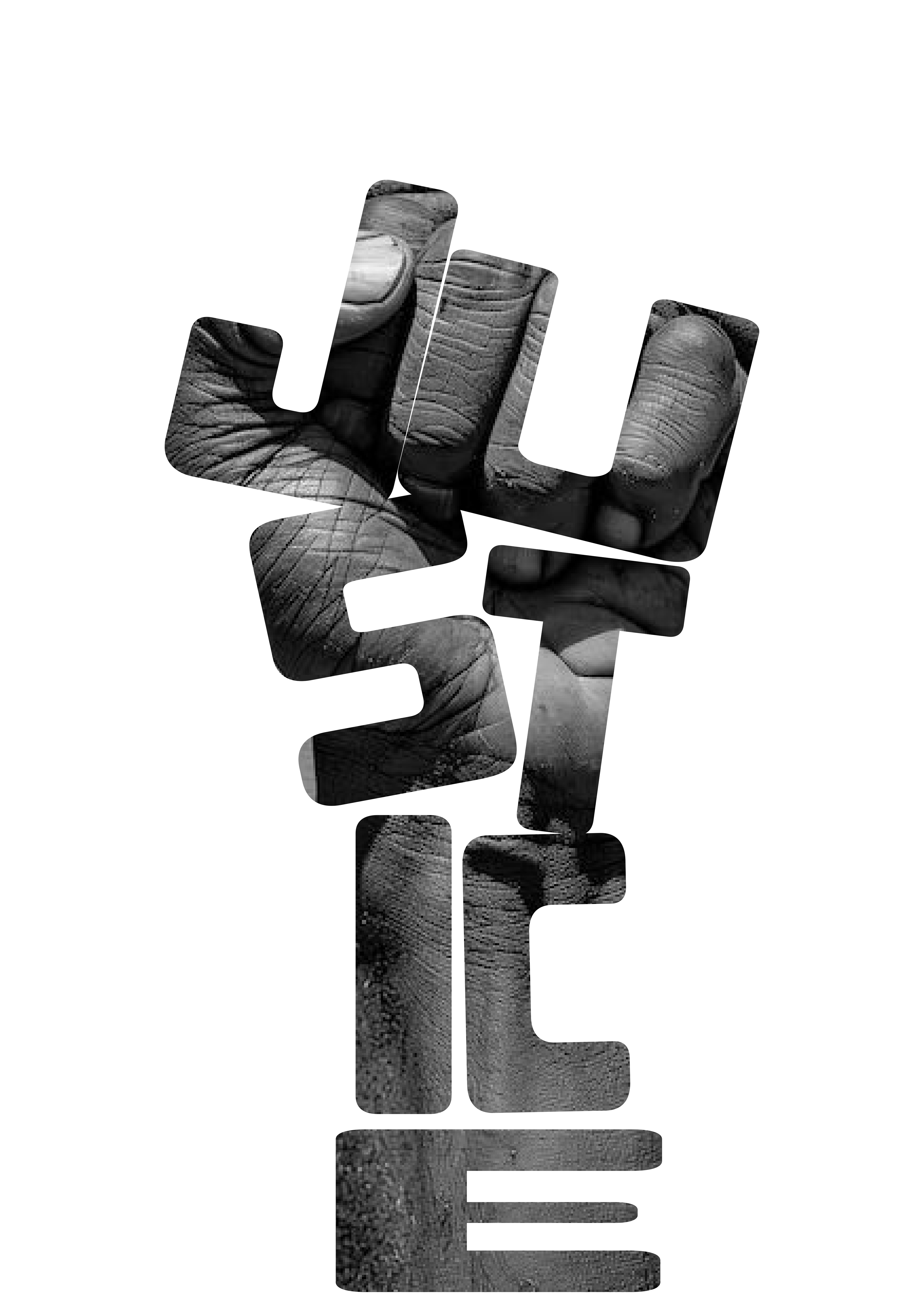
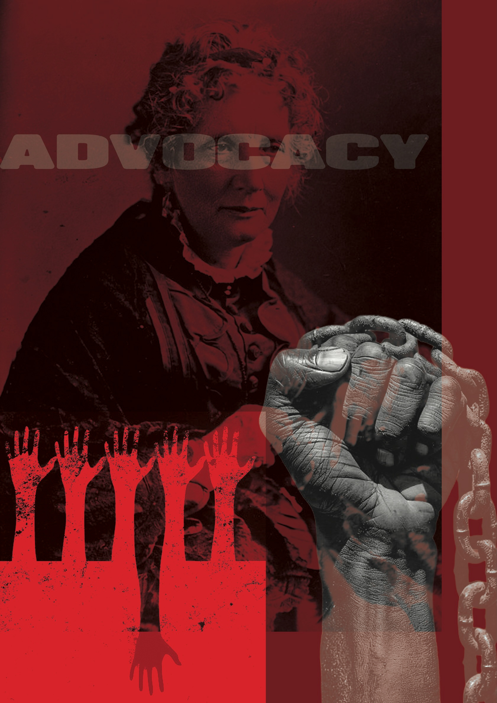
Digital designs were created while exploring the main message for the poster. Experimentation helped identify problems and develop a stronger design direction.
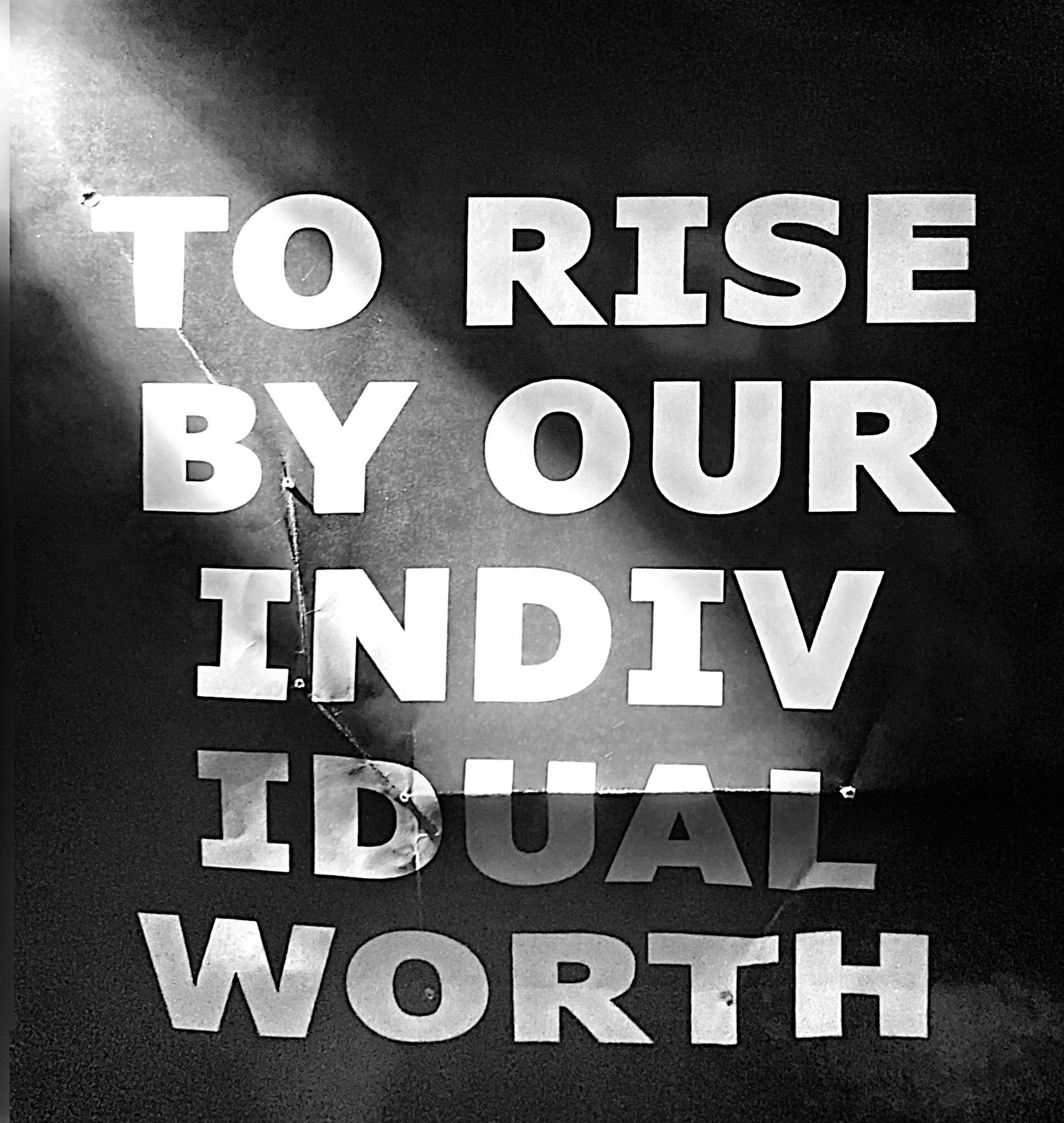
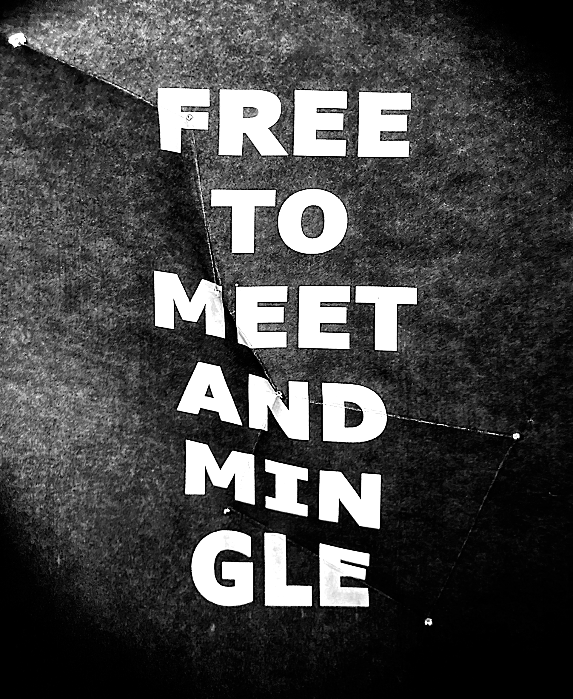
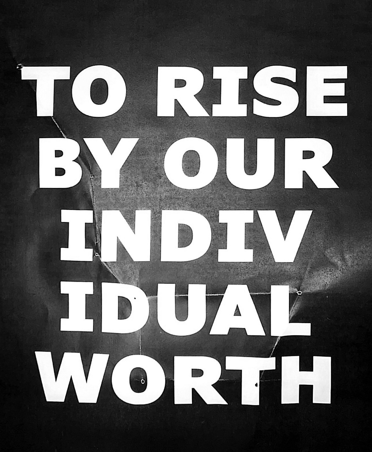
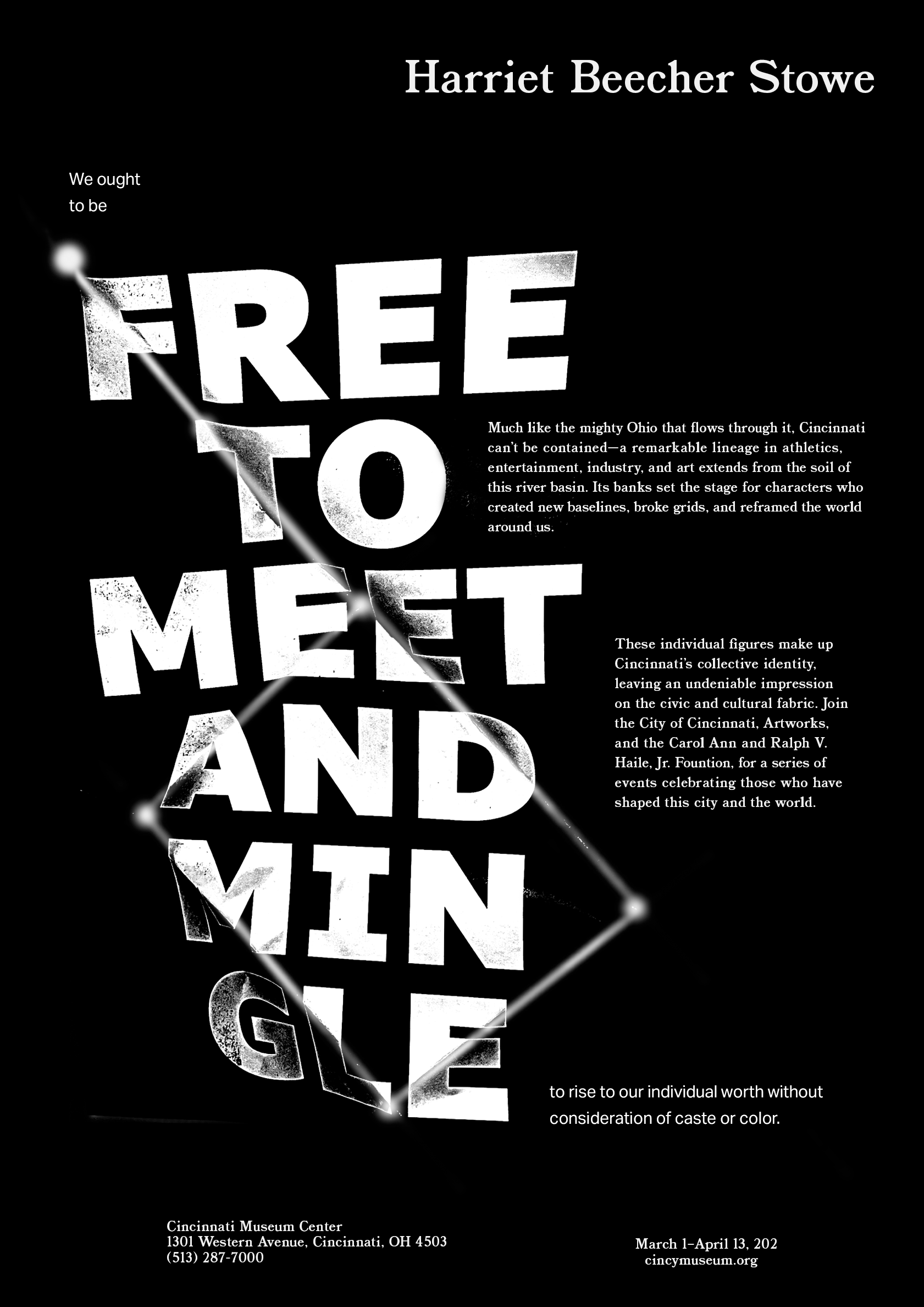
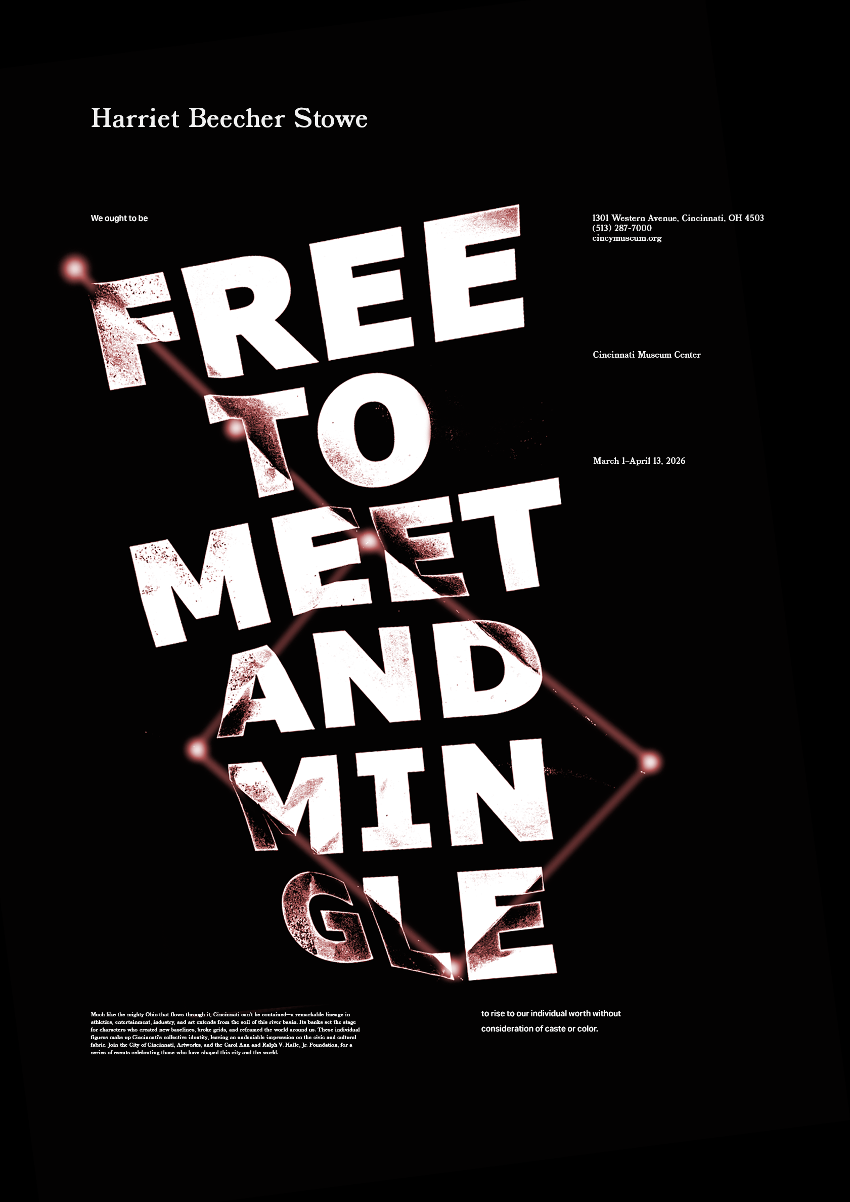
The concept used a Harriet Beecher Stowe quote with a constellation design based on the project prompt. The quote was folded into the shape of the Big Dipper to connect the design to the Underground Railroad and the North Star.
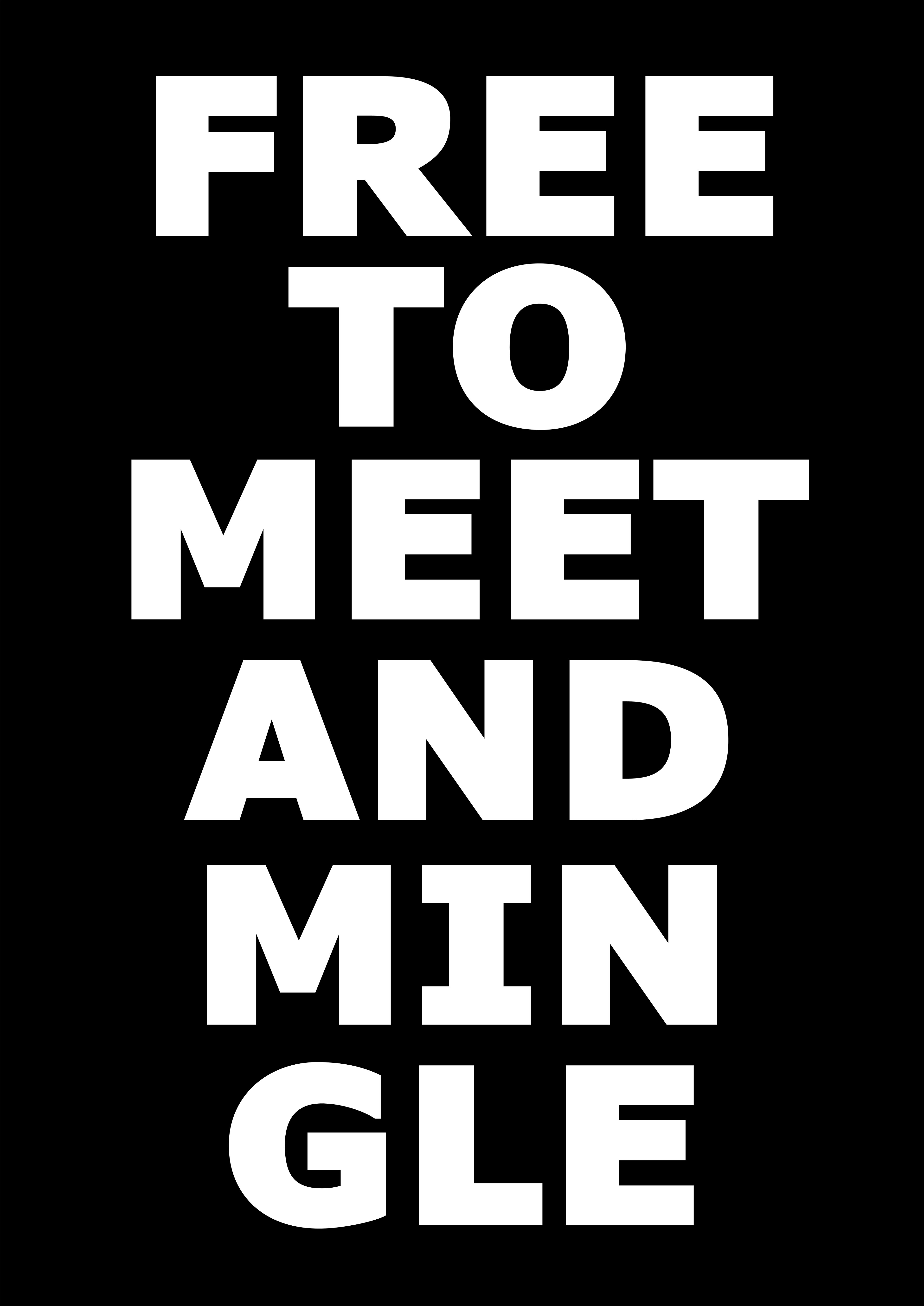
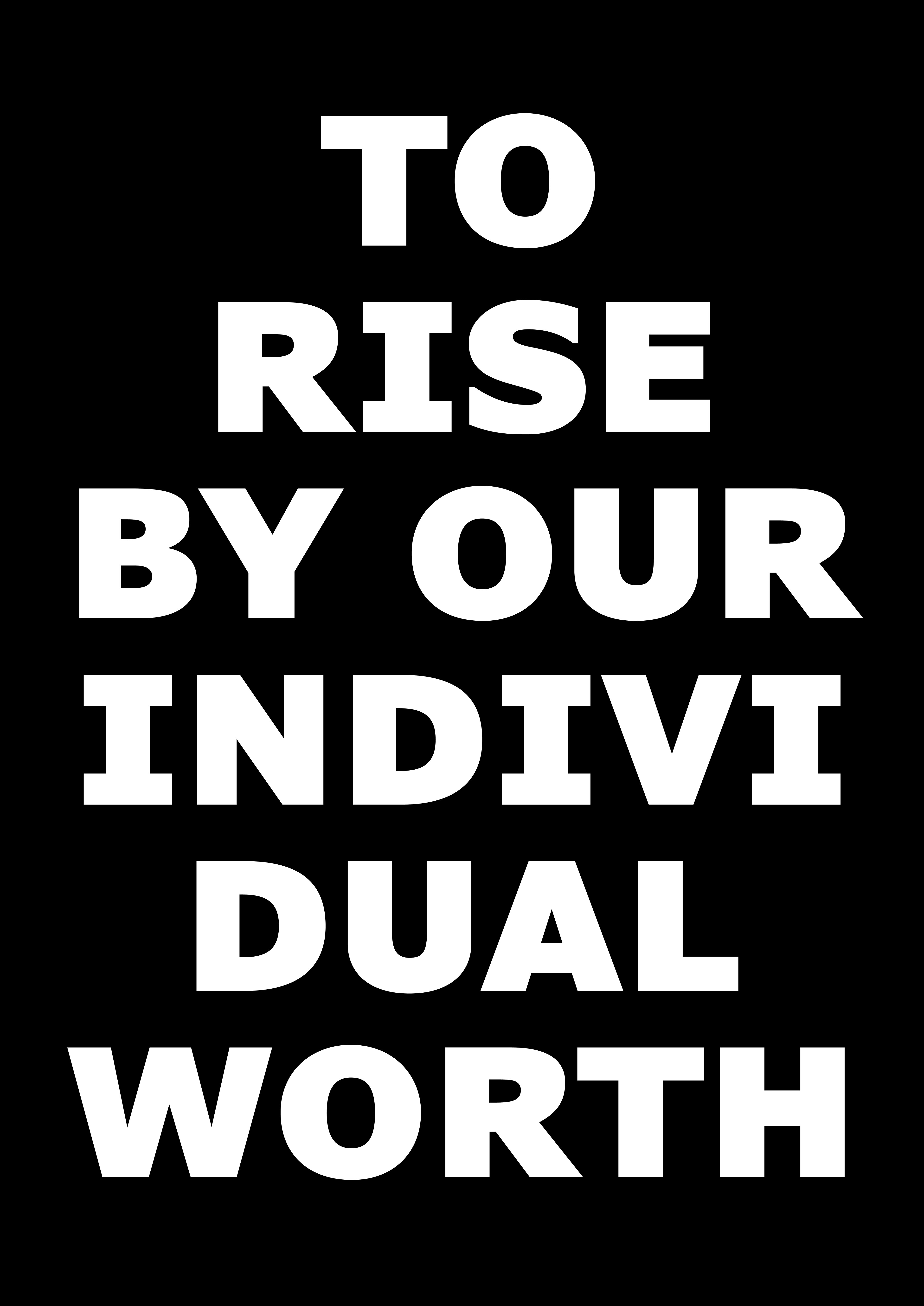
Concept Iterations
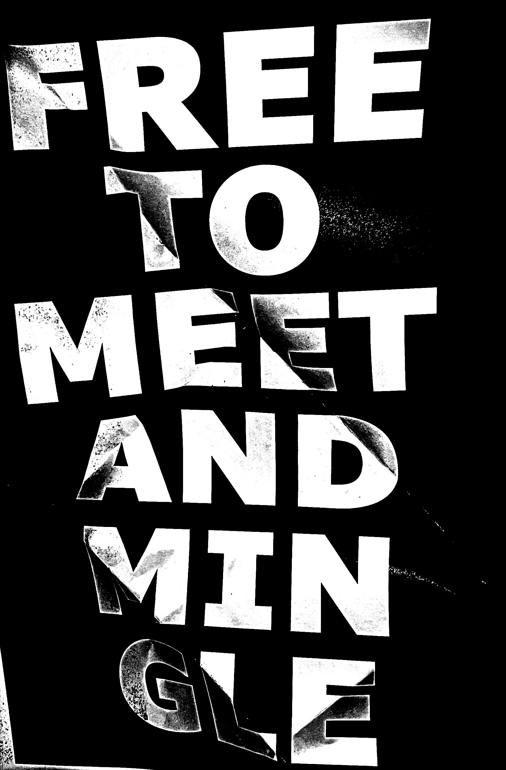

Digital Iterations
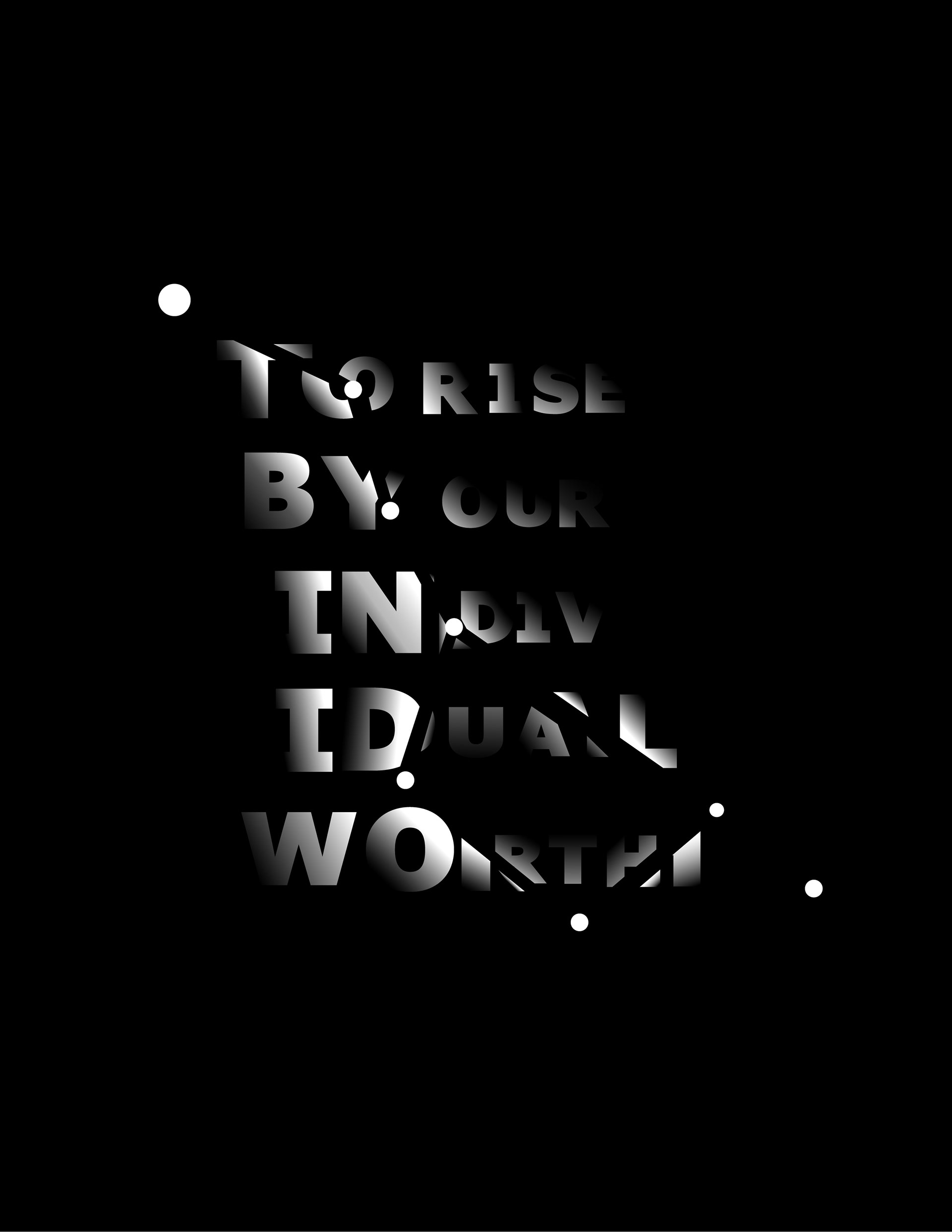
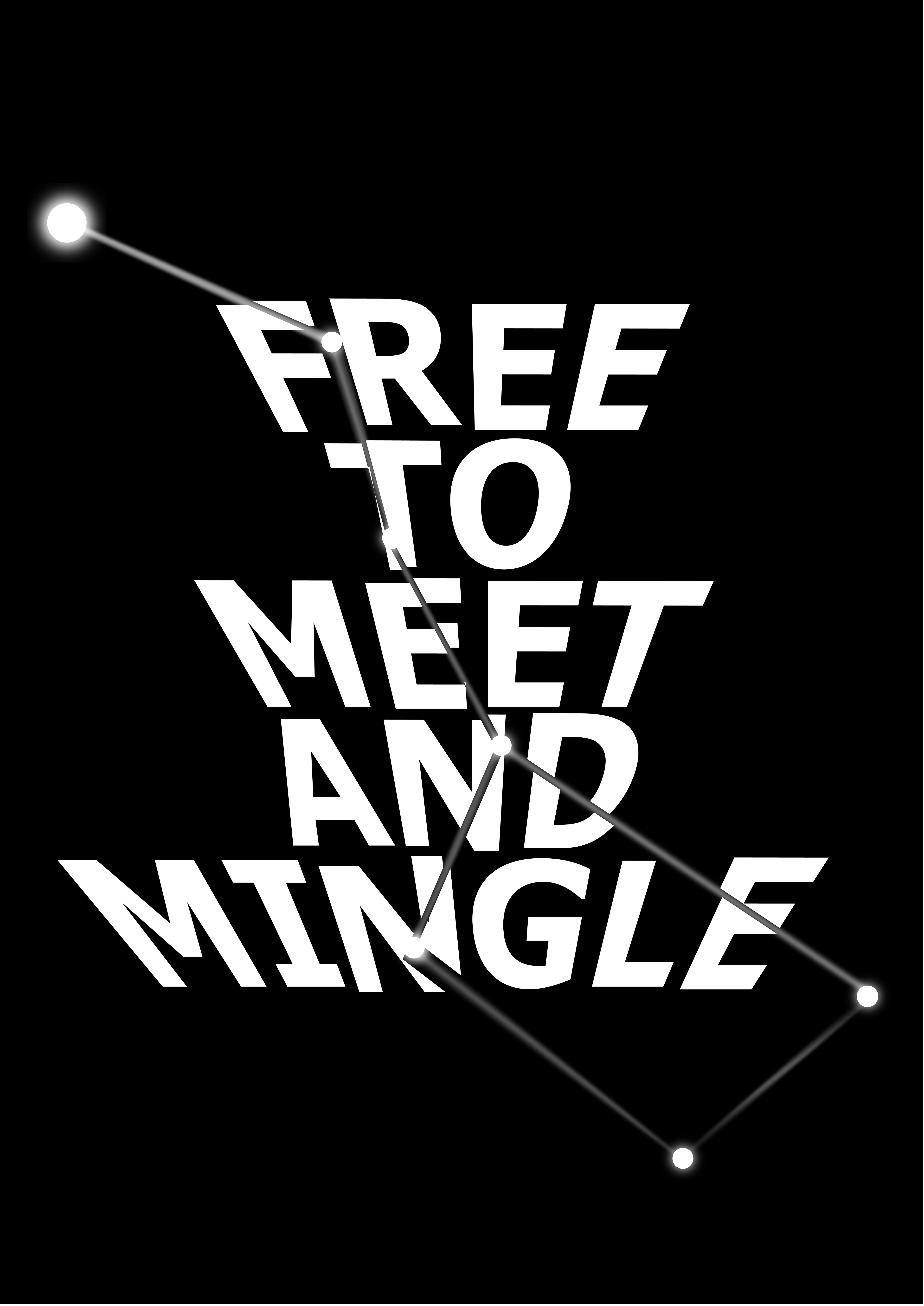
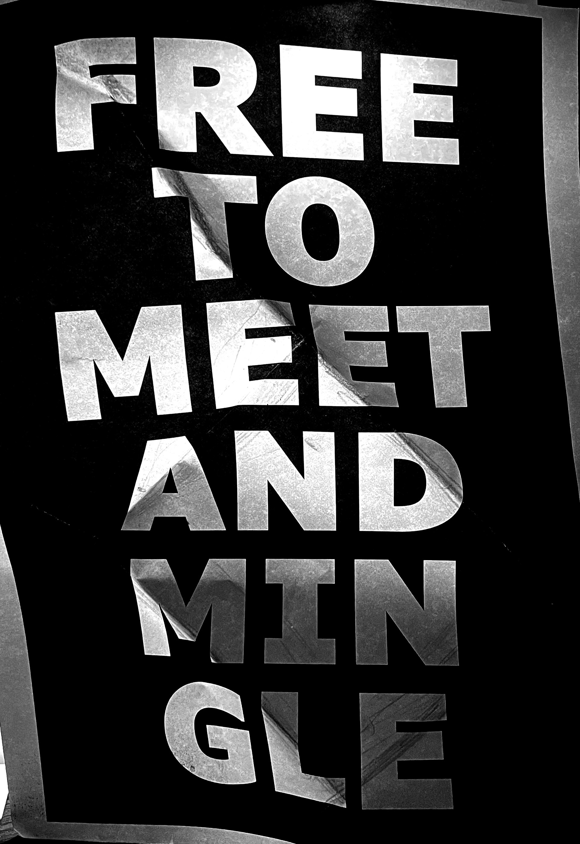
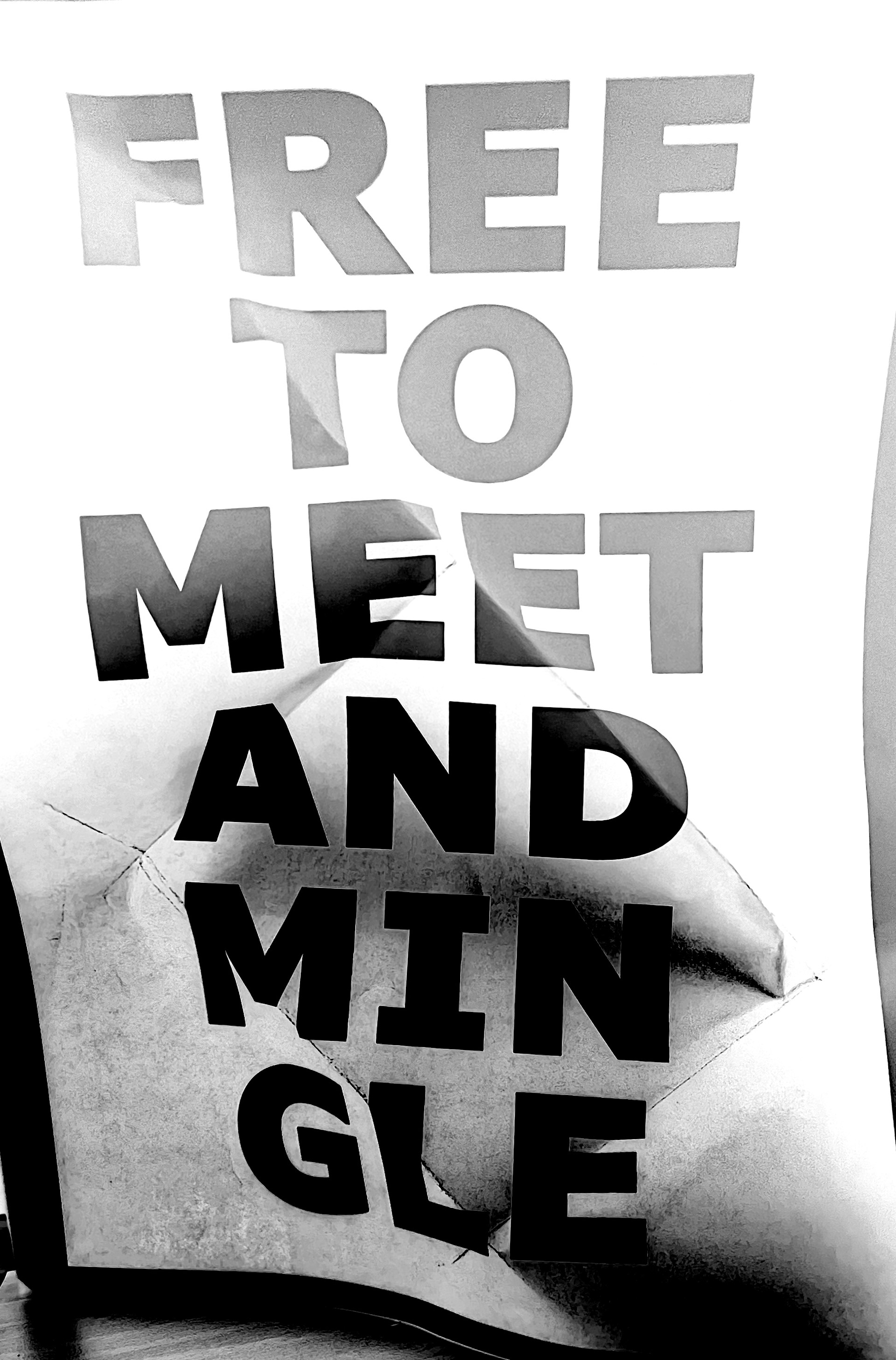
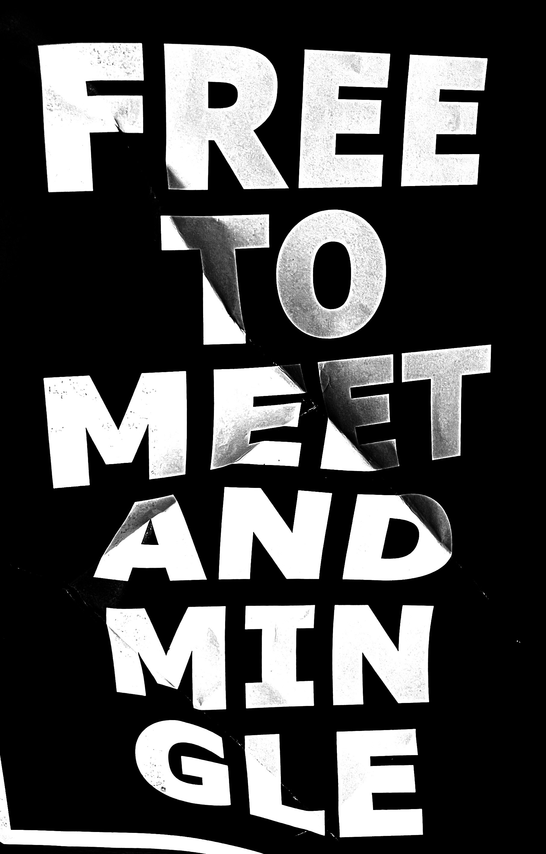
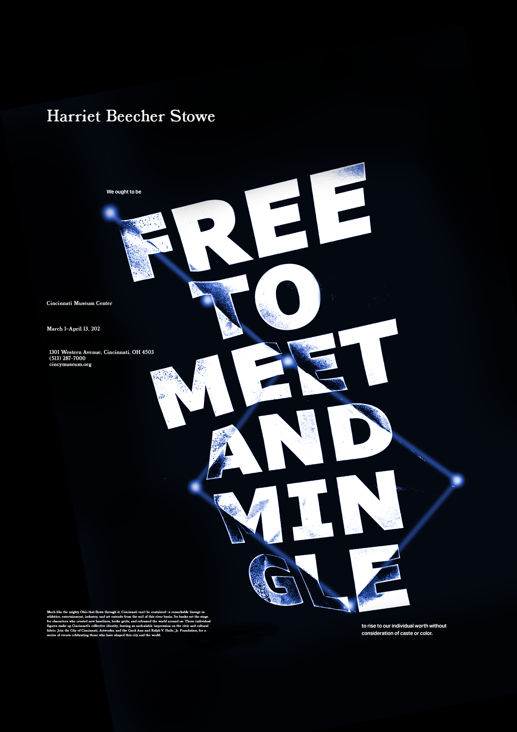
After developing an idea on paper, digital experimentation was used to explore the concept further. The folded paper photo was chosen as the best way to create the desired effect.
Final
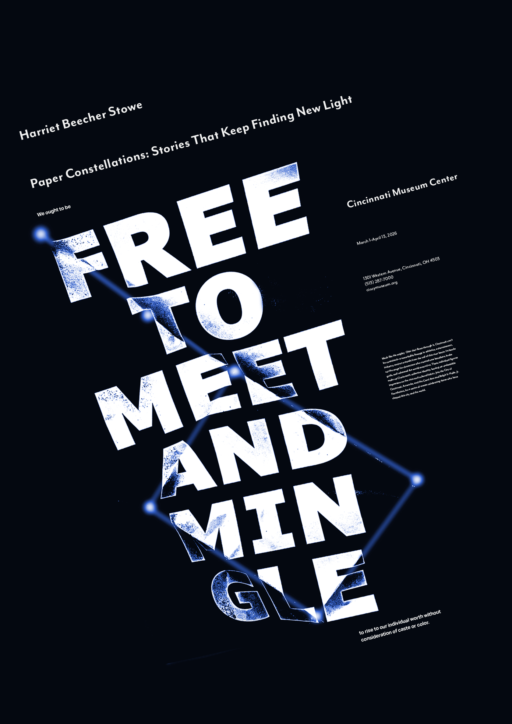
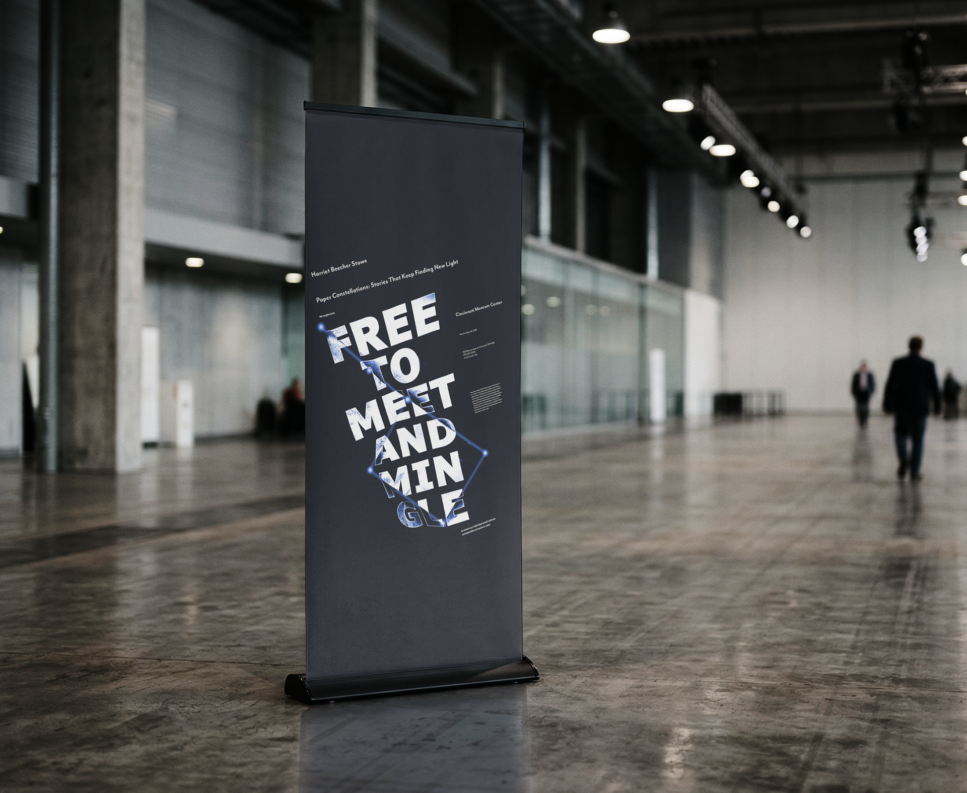
The final design used the constellation’s axis to align the text and create unity. Blue was added to represent the sky and the resilience of enslaved people