Objective
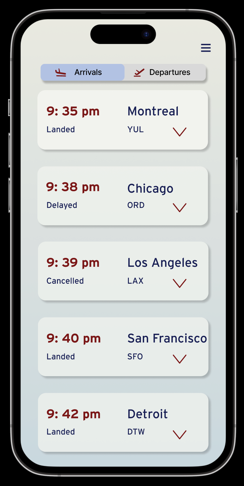
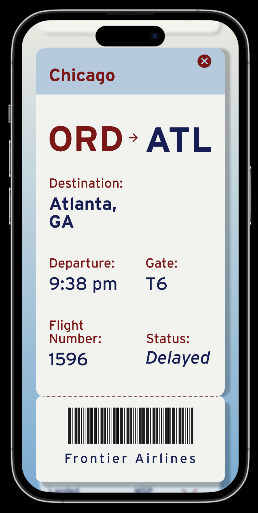
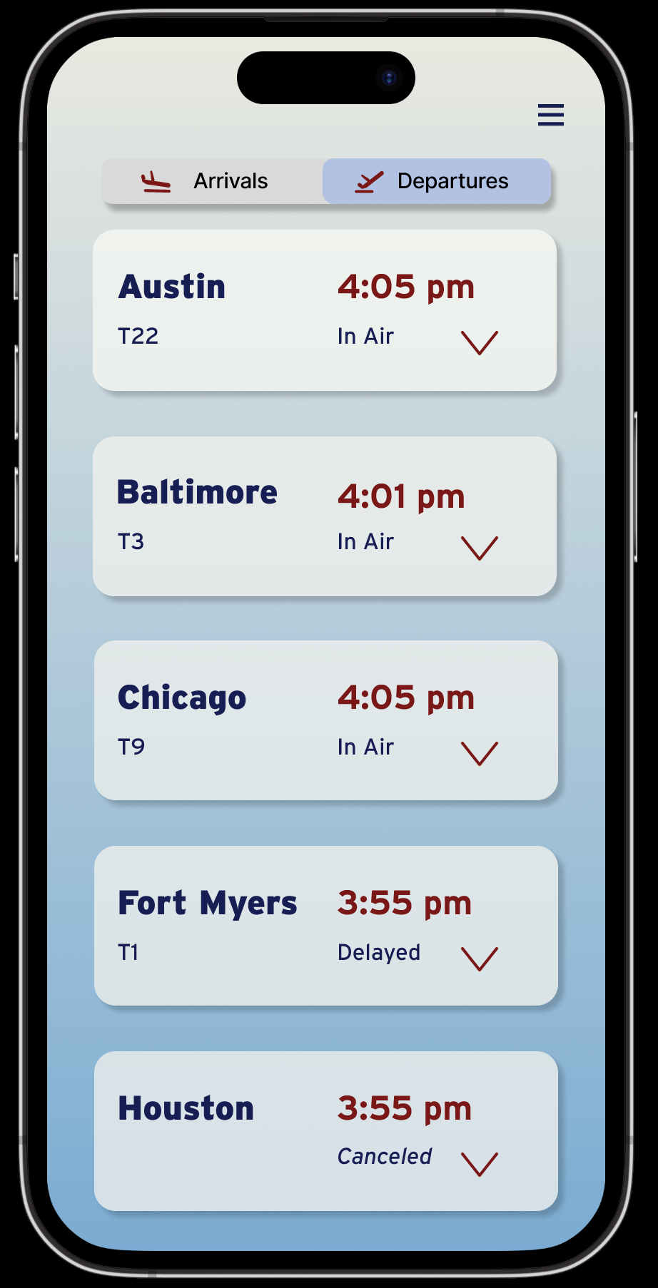
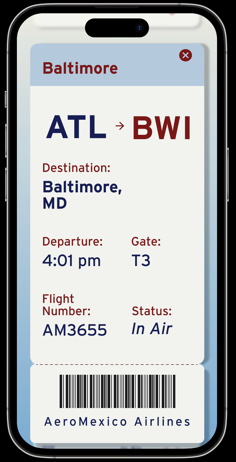
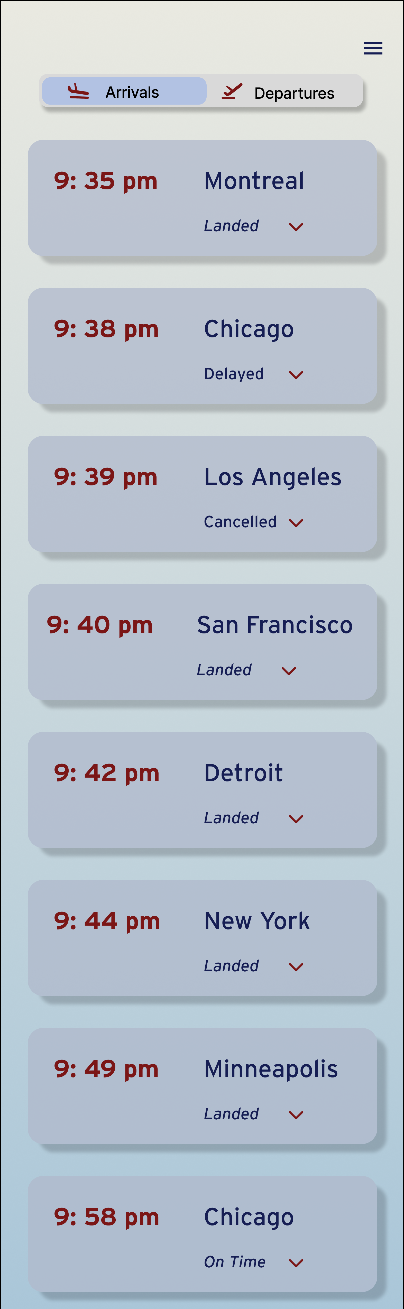
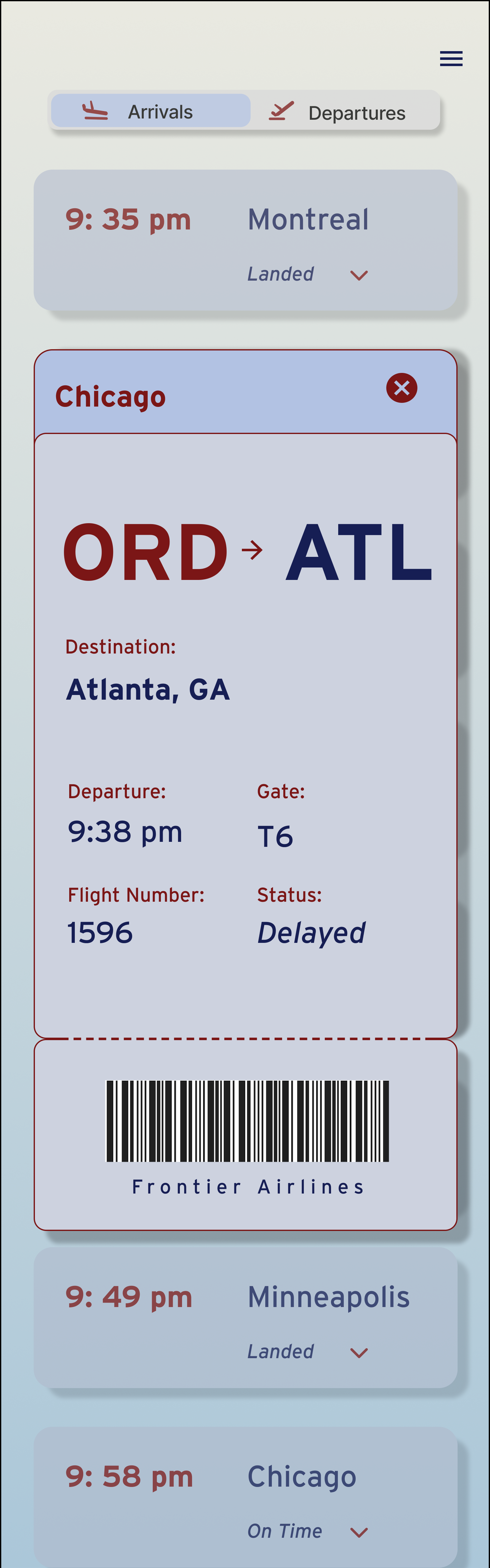
This project focuses on designing a mobile Flight Information Display System (FIDS) that communicates real-time flight data using clear typographic hierarchy and grid systems. The goal was to organize complex information into a readable, user-friendly format across multiple screens.
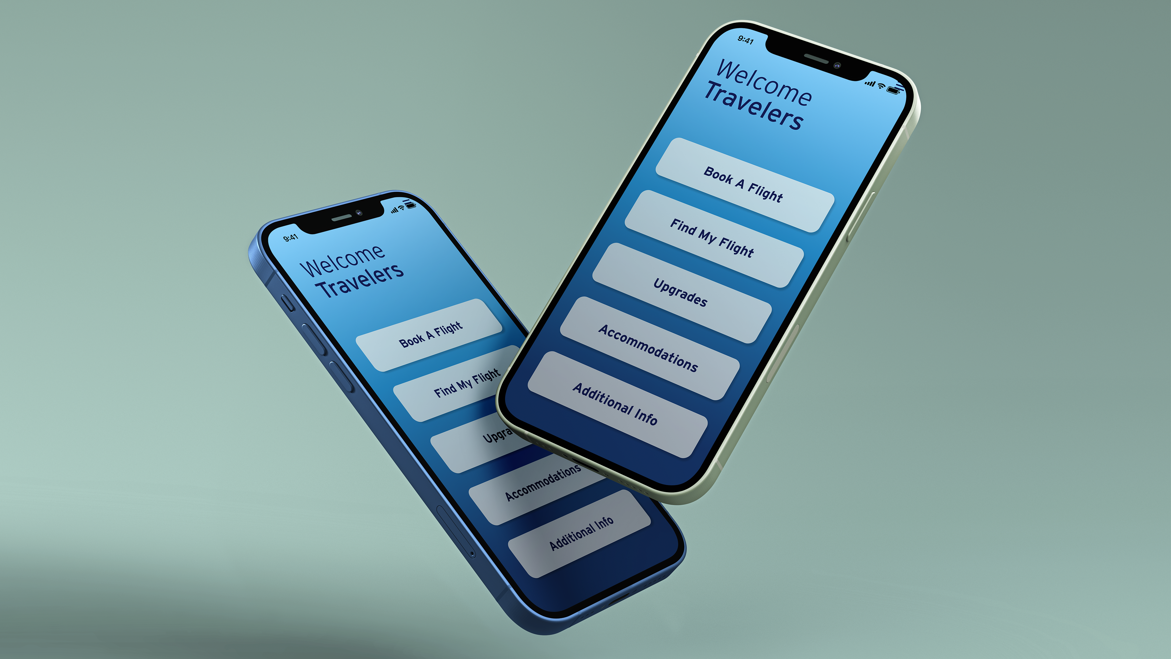
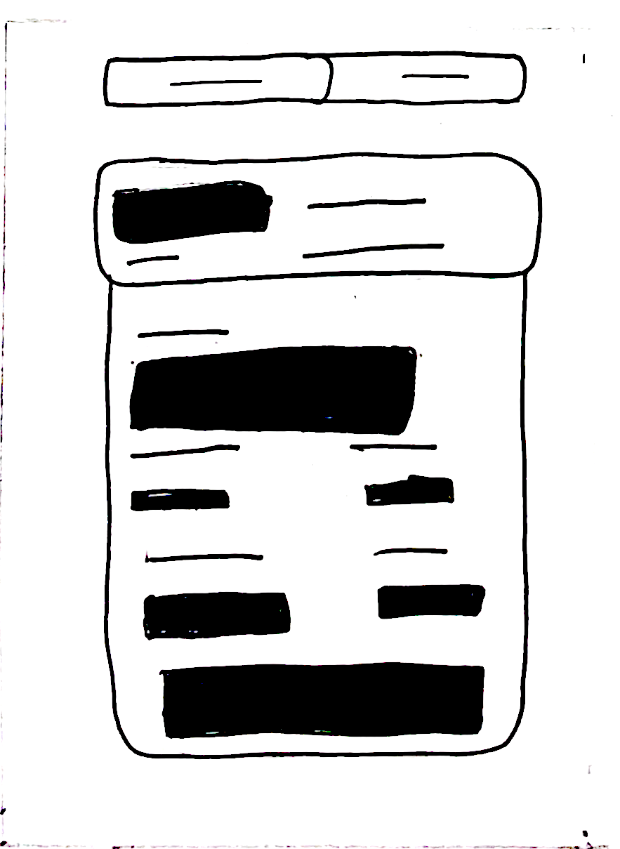
Sketches
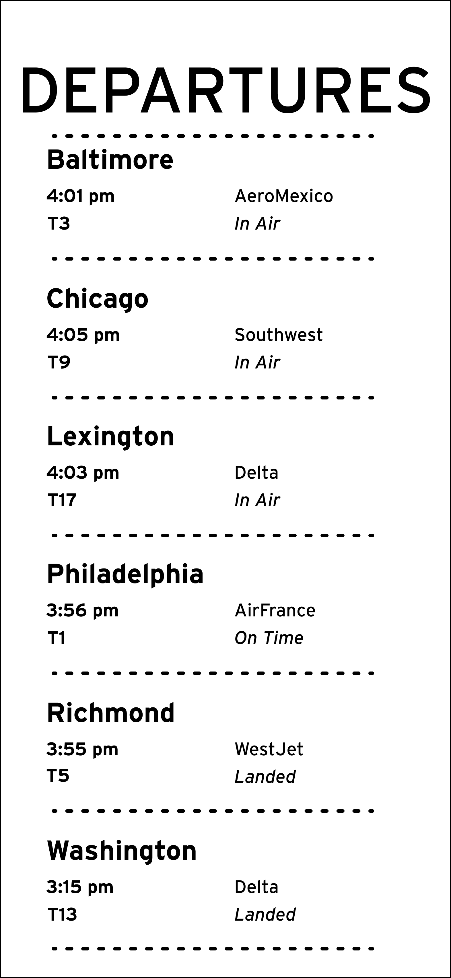
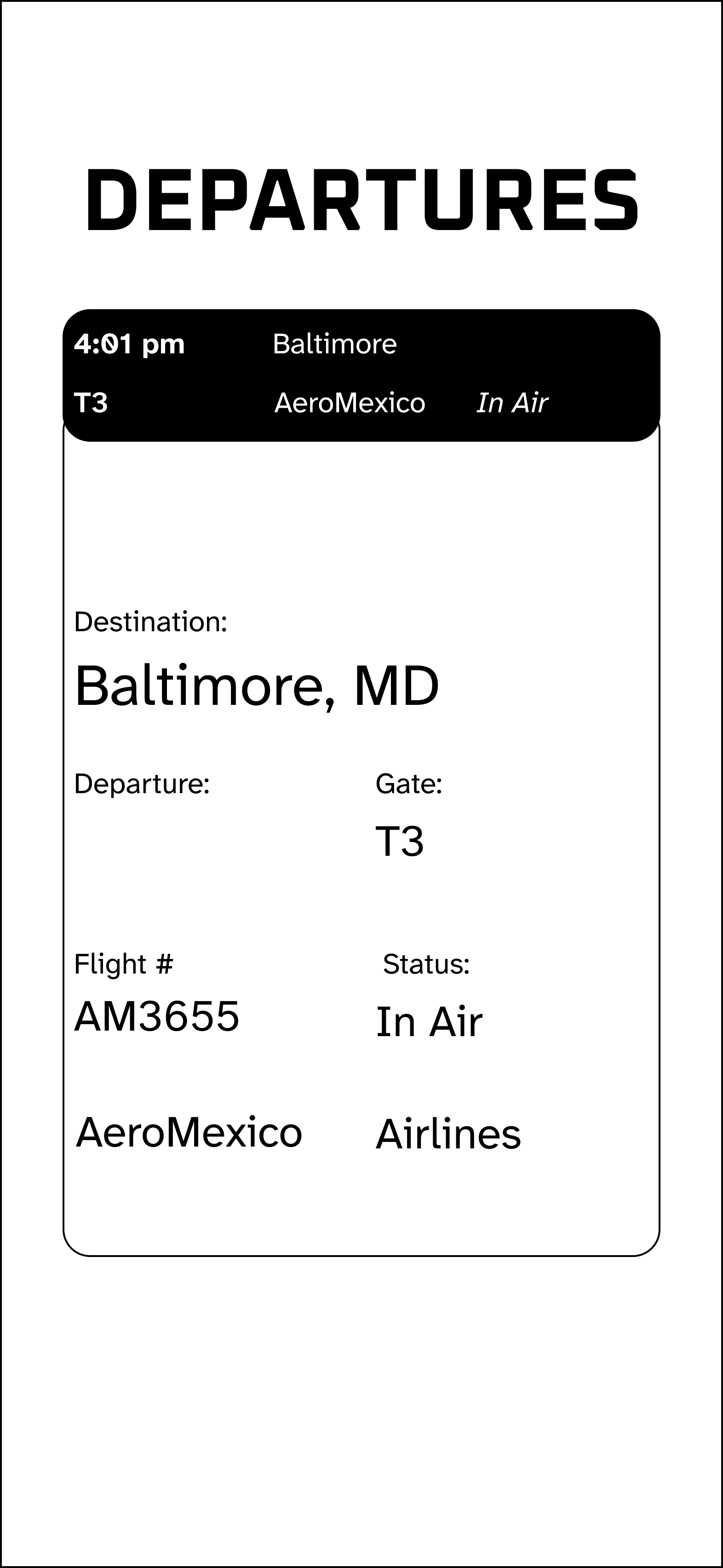
Implementing blocks to group information was successful because it created a clear visual hierarchy.
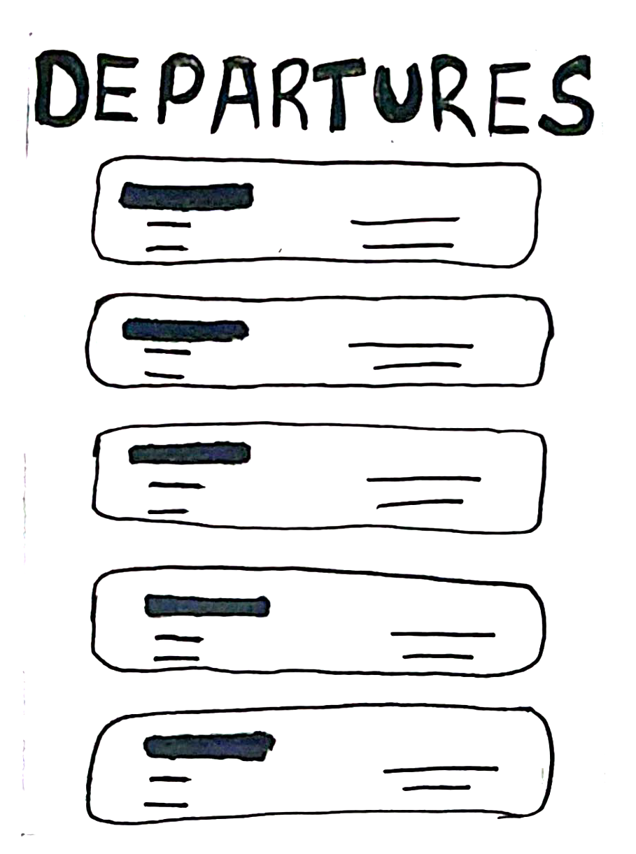
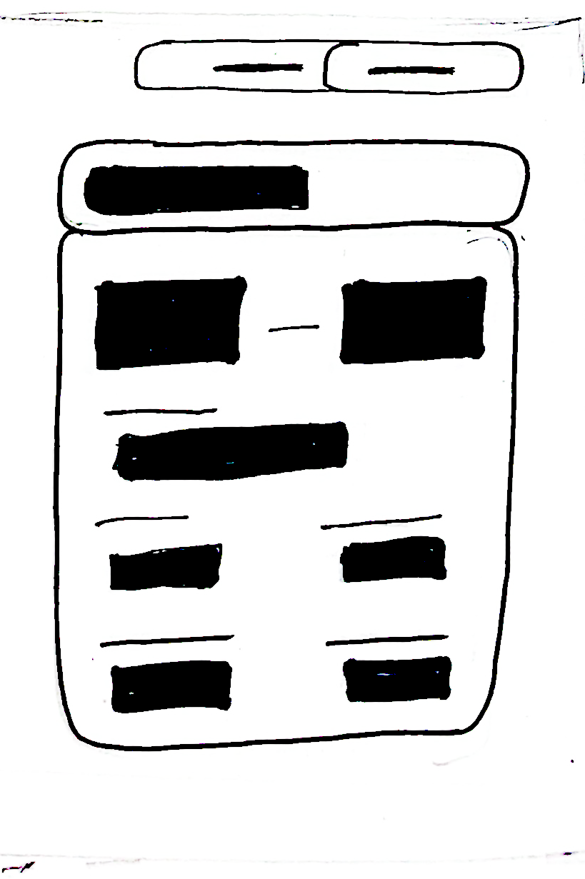
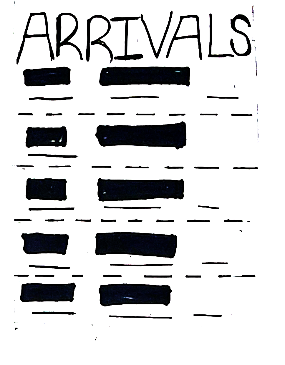
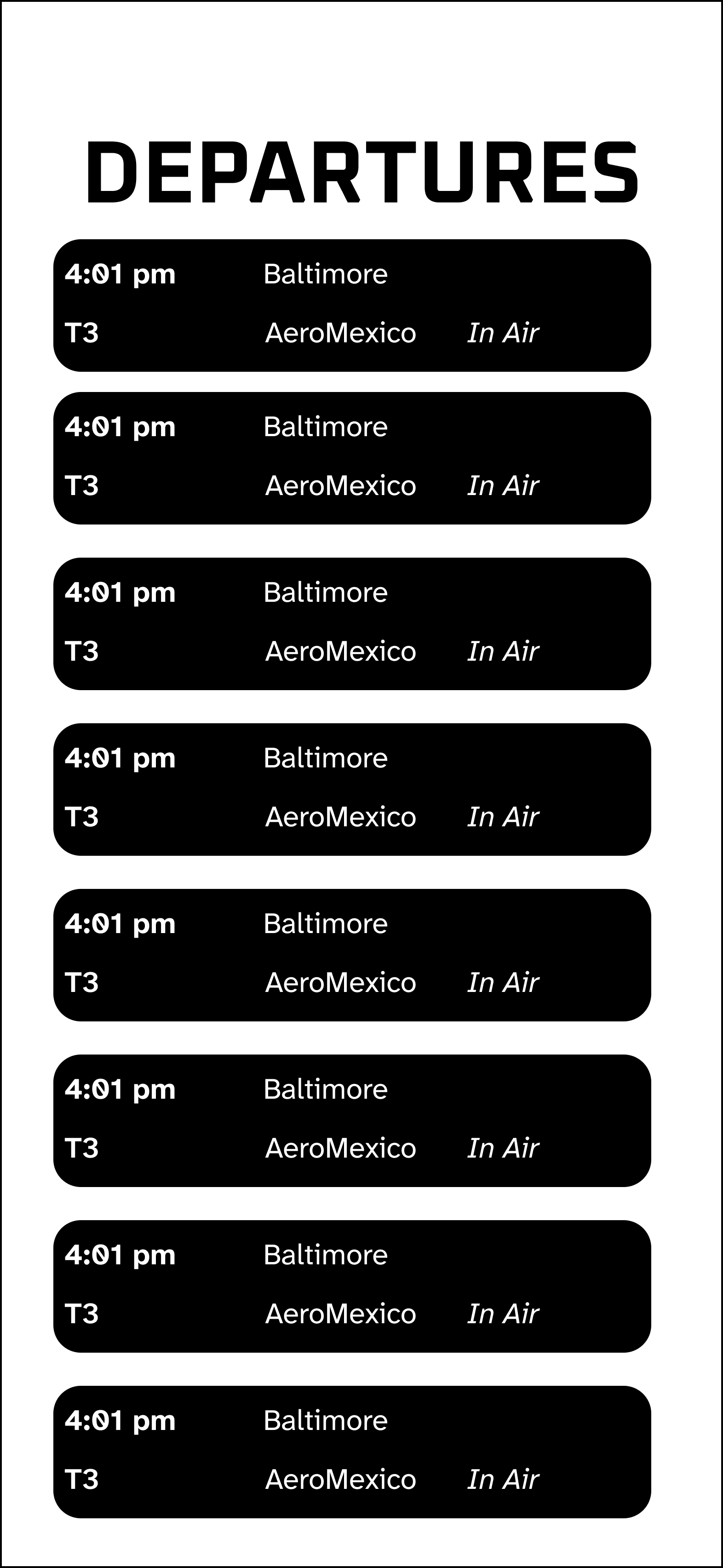
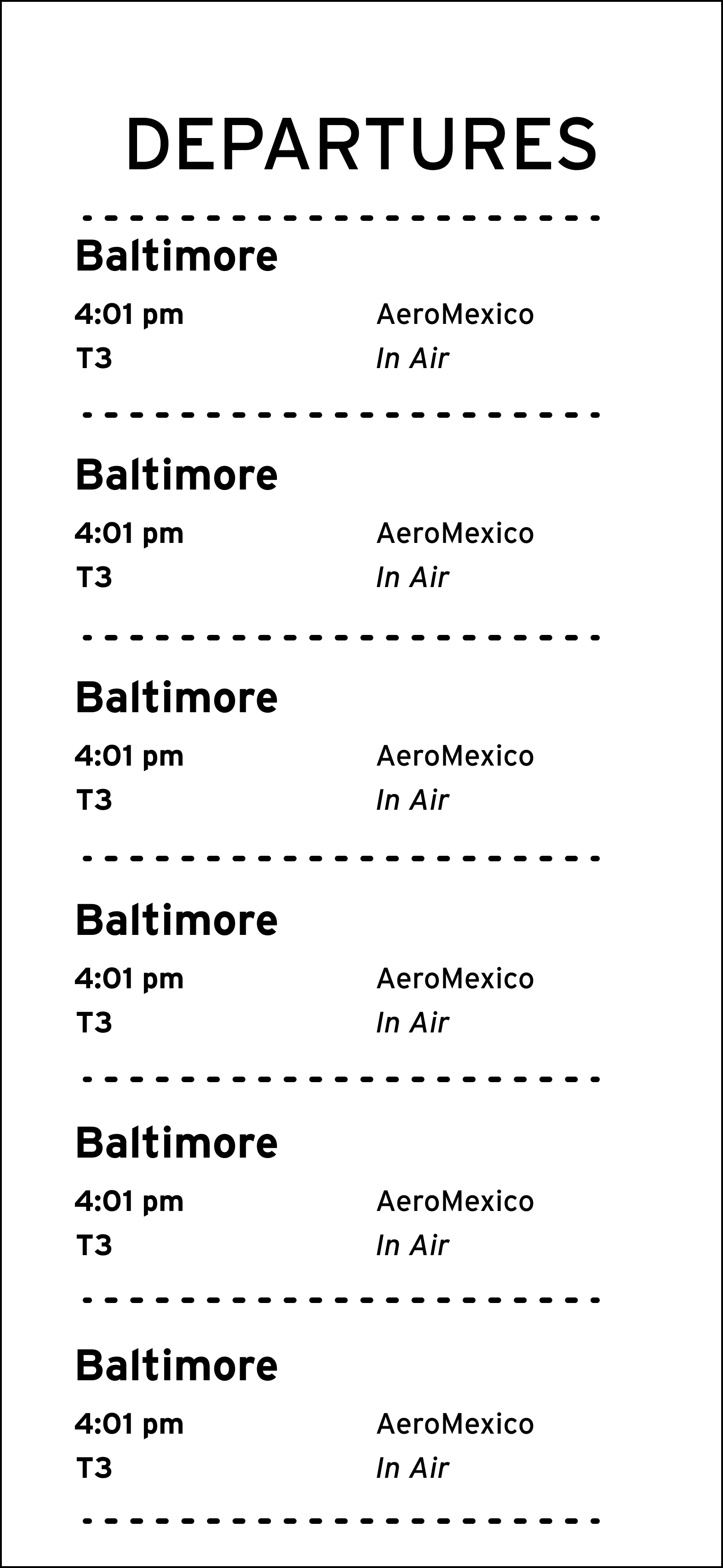
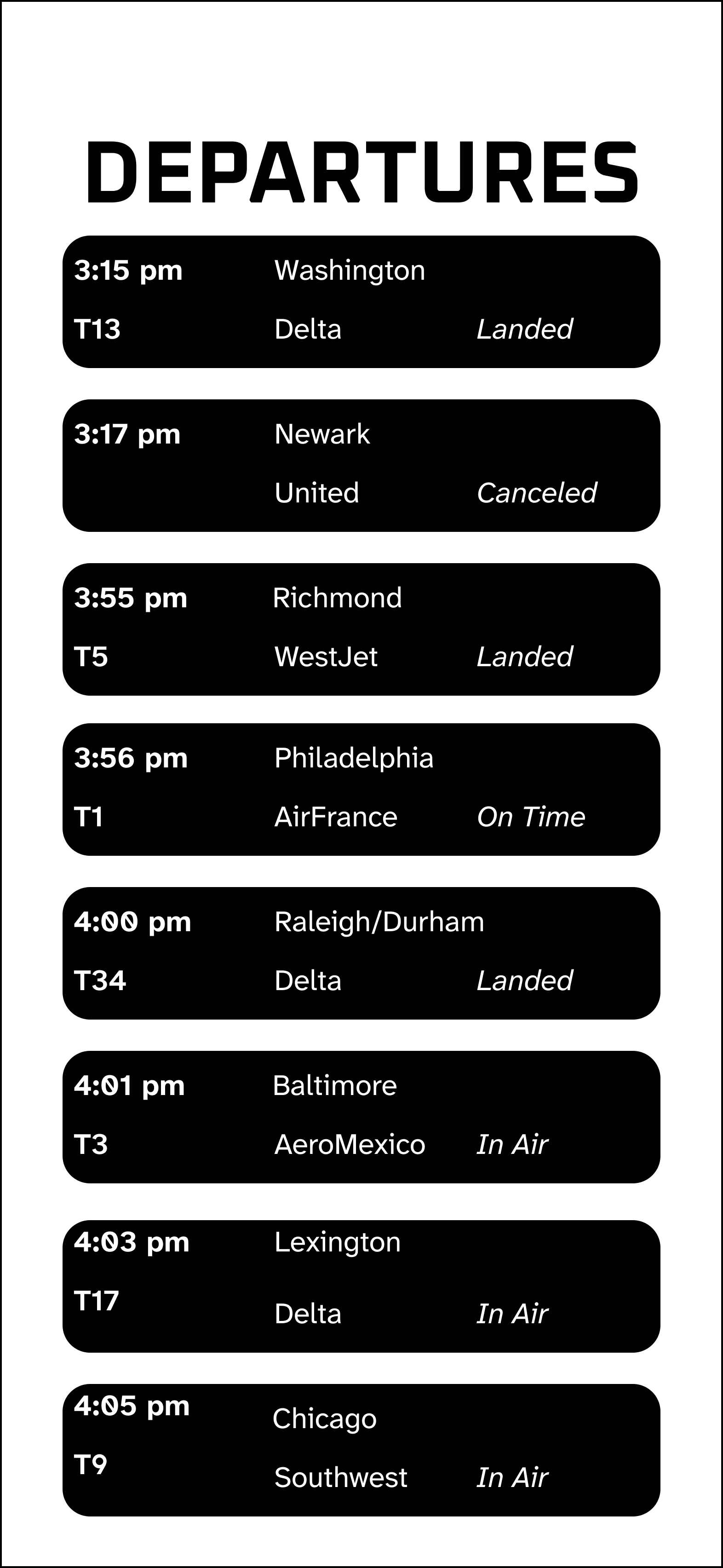
Digital Exploration
High-legibility fonts were explored to accommodate people with visual impairments, and the scale was increased to improve accessibility for users with disabilities.
Color Explorations
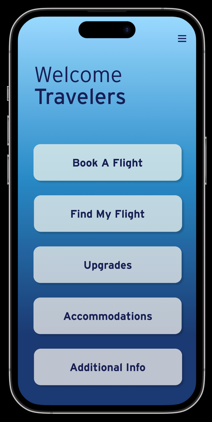
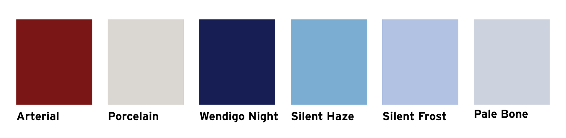
When implementing colors, blue was chosen because of its connection to the sky and its use in other successful airport apps. A dark red provides contrast against the blues, creating a focal point for the text.
Final App Design
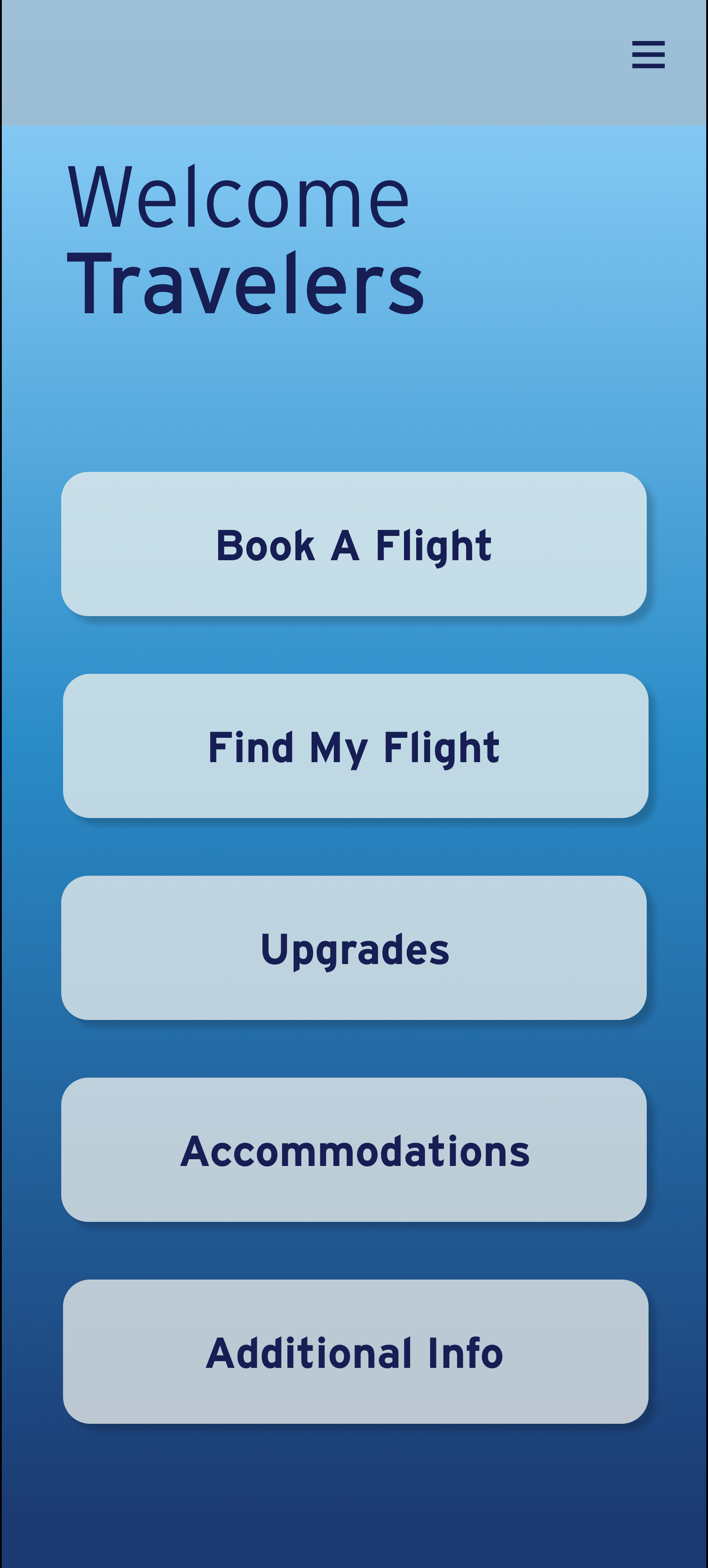
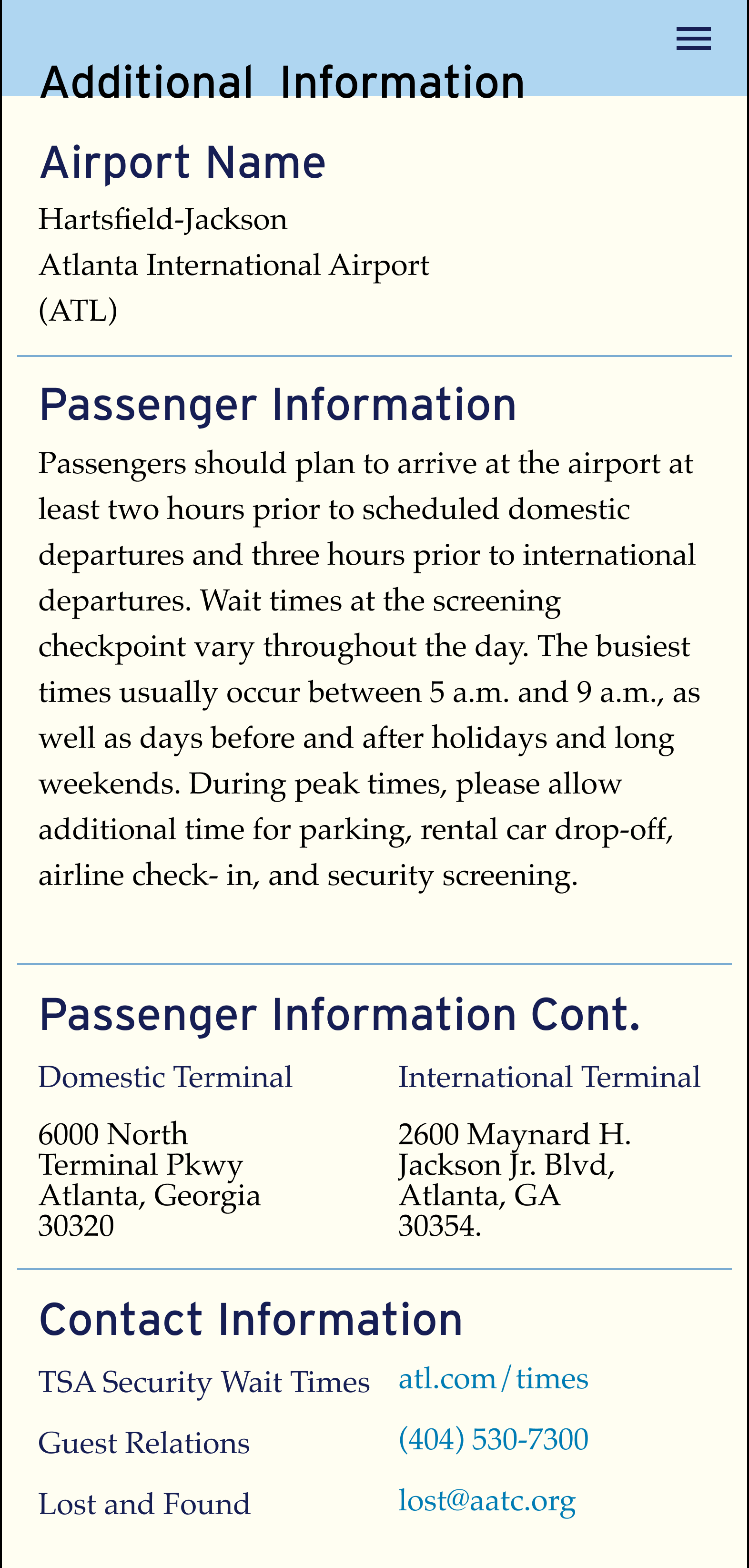
The strongest concept was refined using consistent typography, accessible layouts, and a cohesive color system. The final design improves navigation, hierarchy, and readability while balancing functionality and aesthetics.